Designer: Patrick Lindsay
Materials Direct’s big Idea was More than Materials, Momentum. A fast-moving, future-ready brand built for growth. Everything they do is designed to simplify the supply chain and support customers with speed, clarity, and confidence.
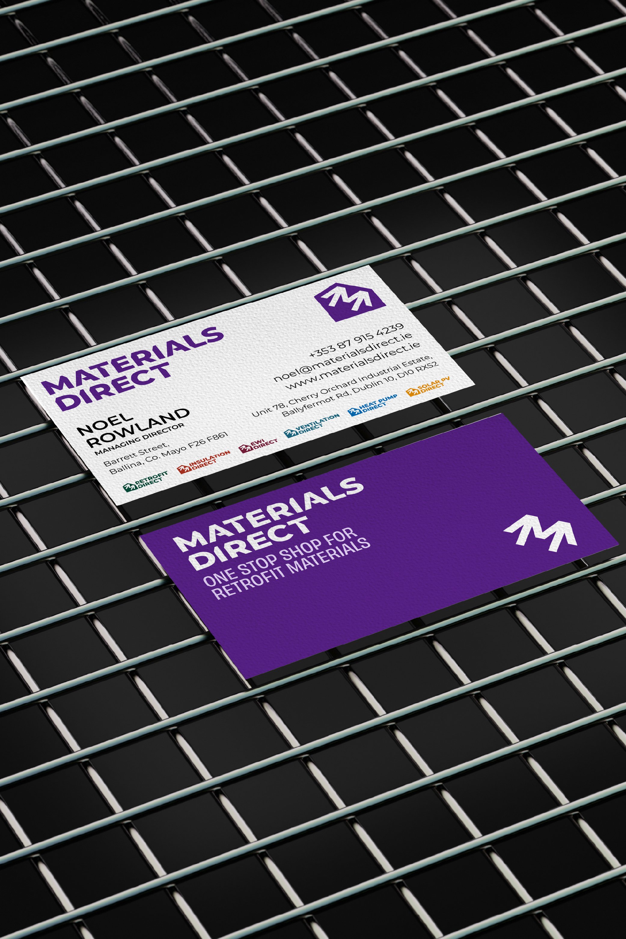
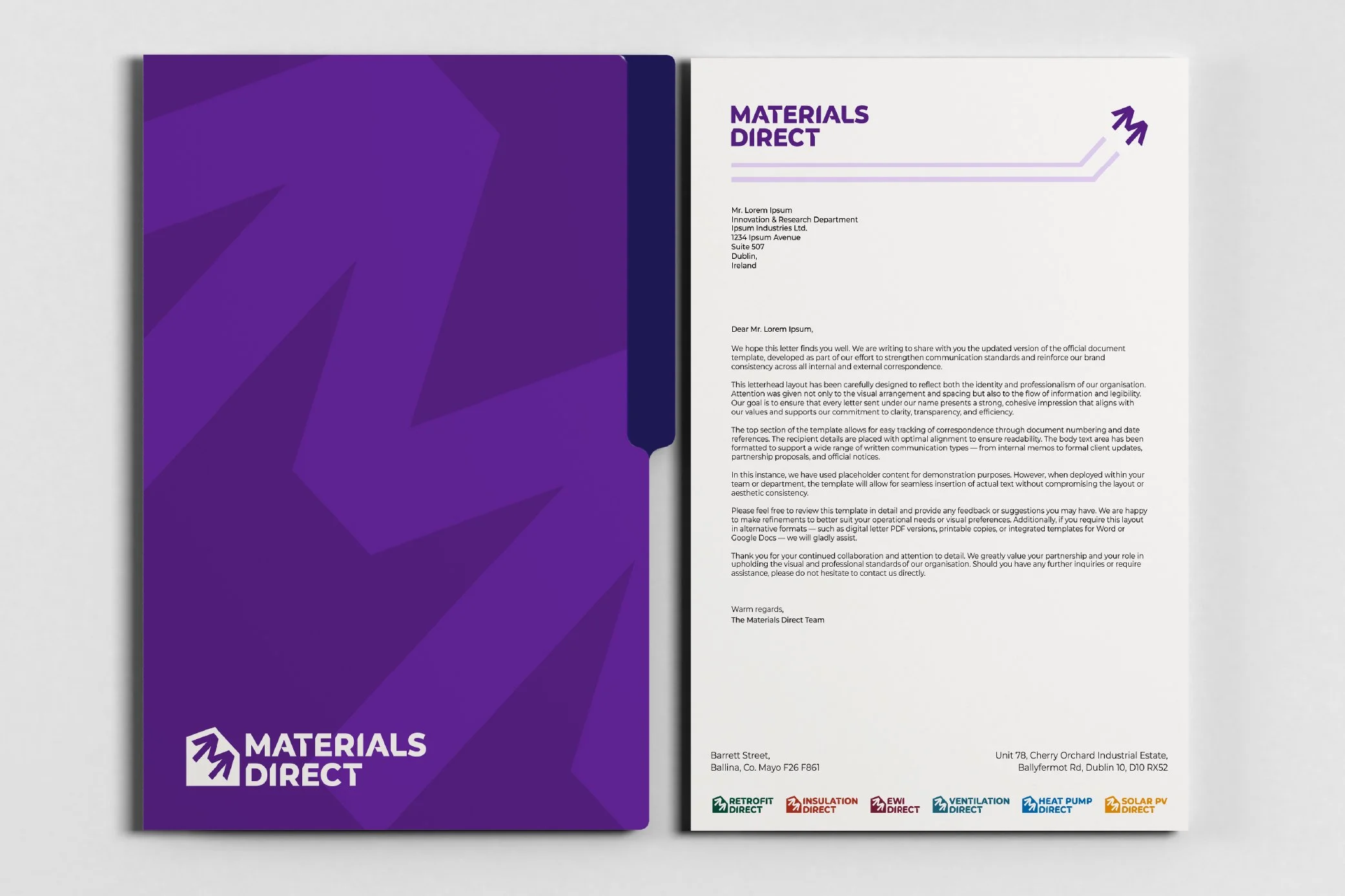
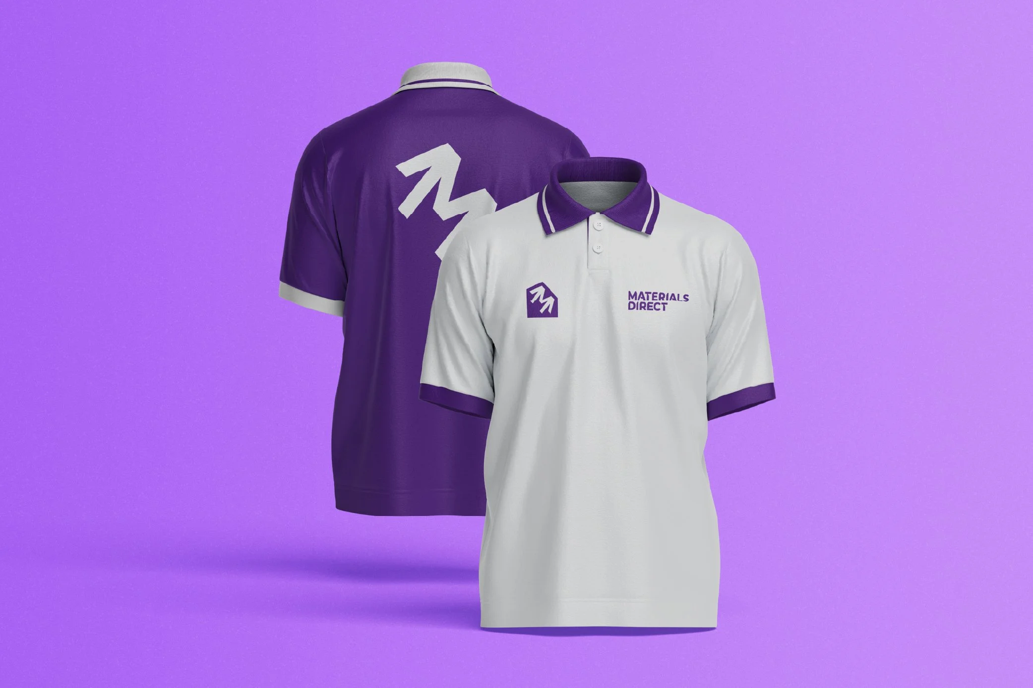
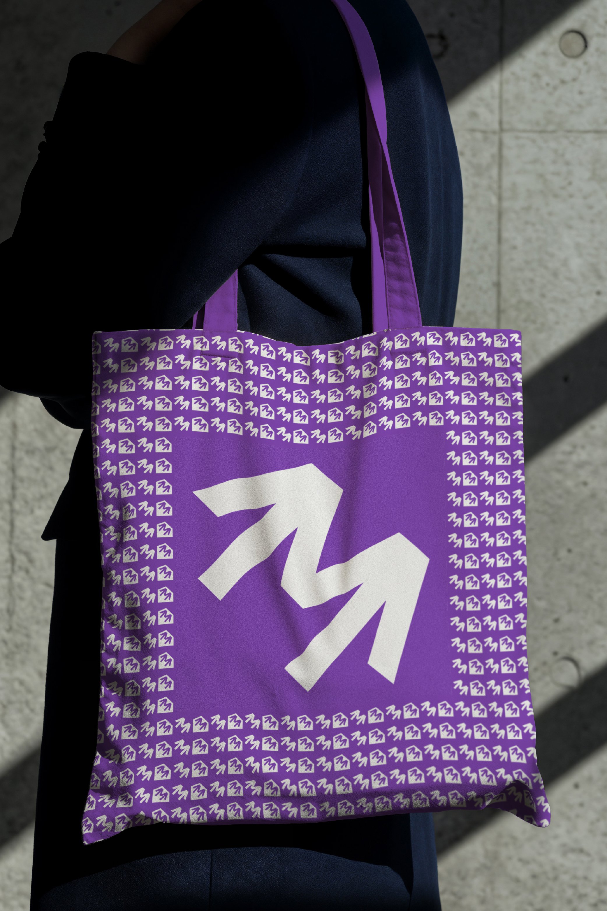
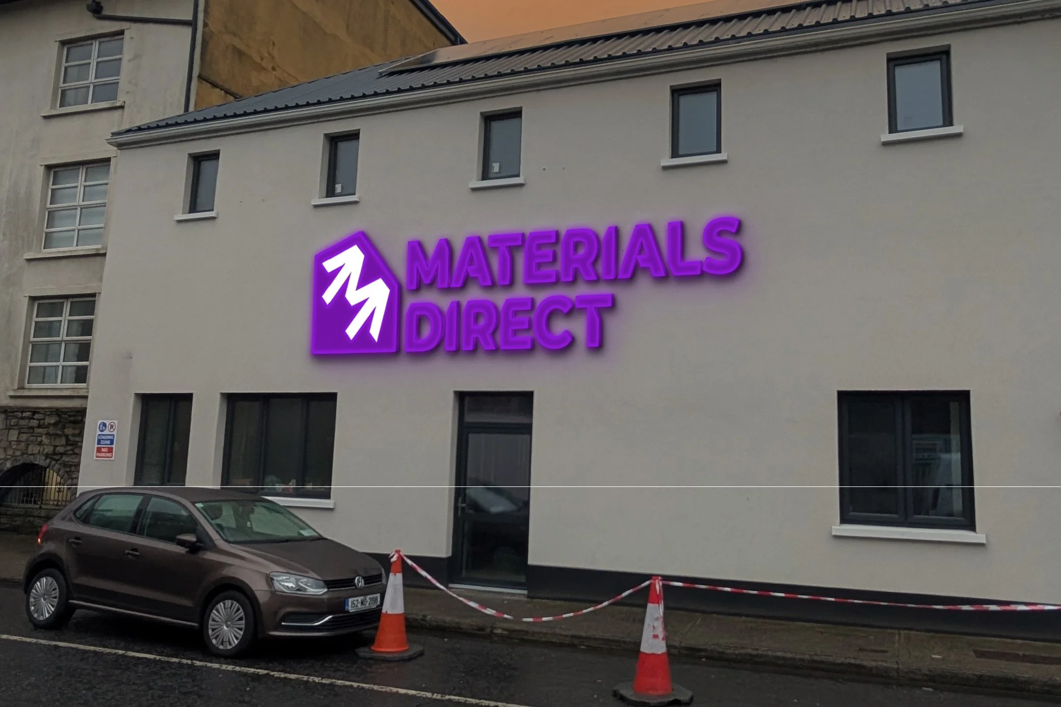
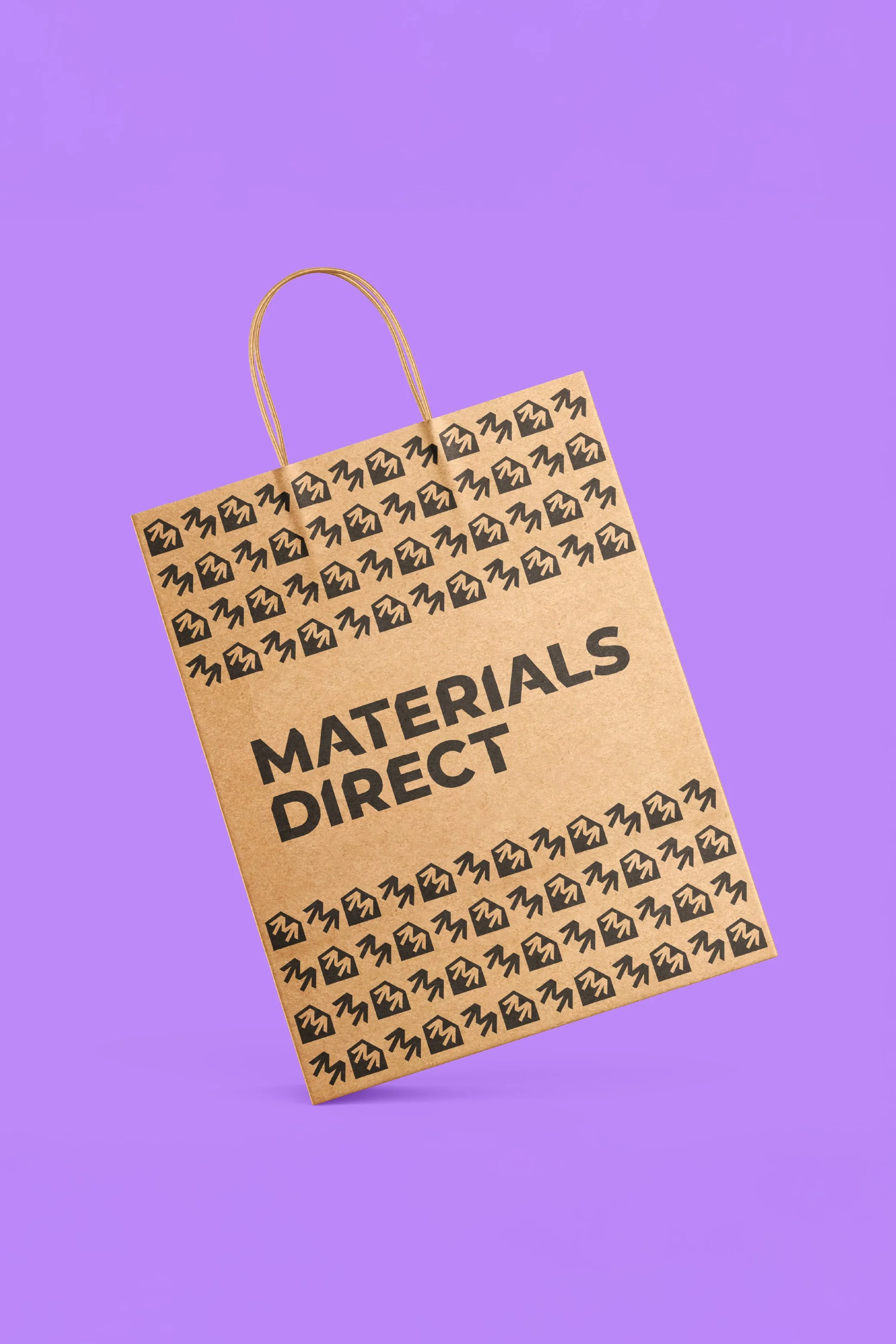
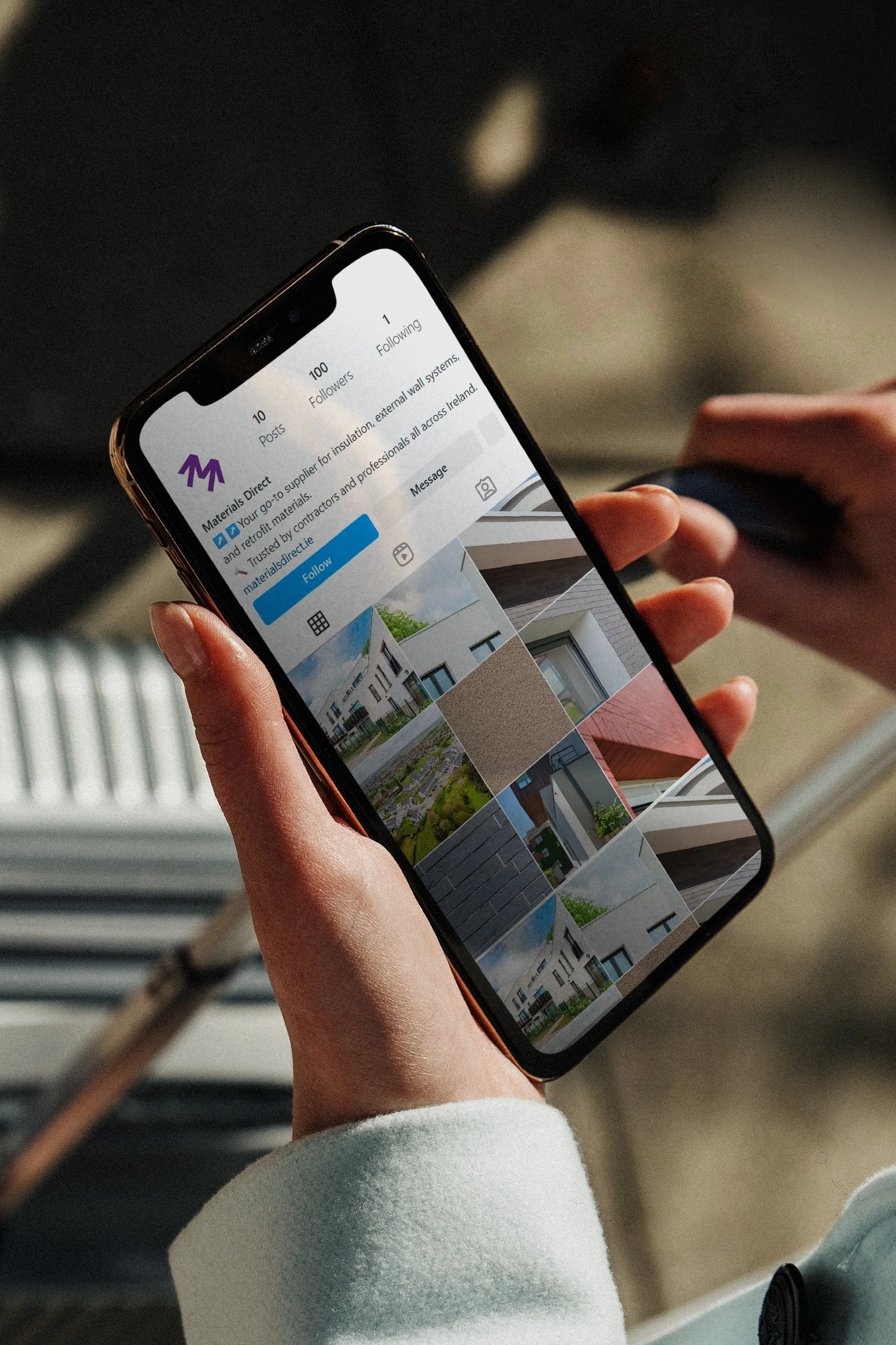
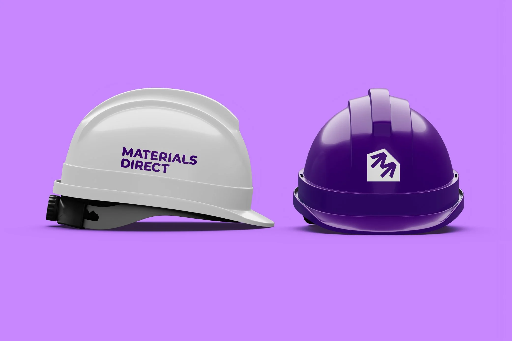
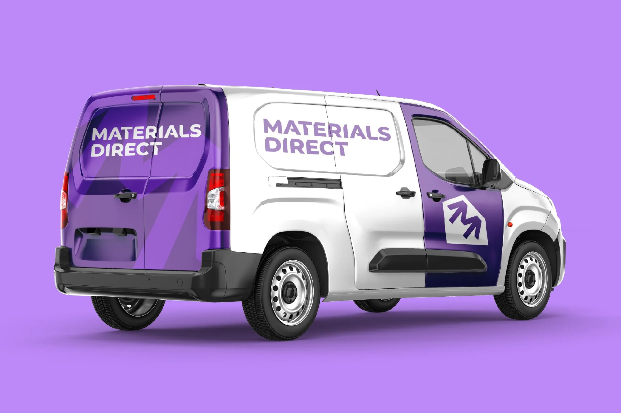
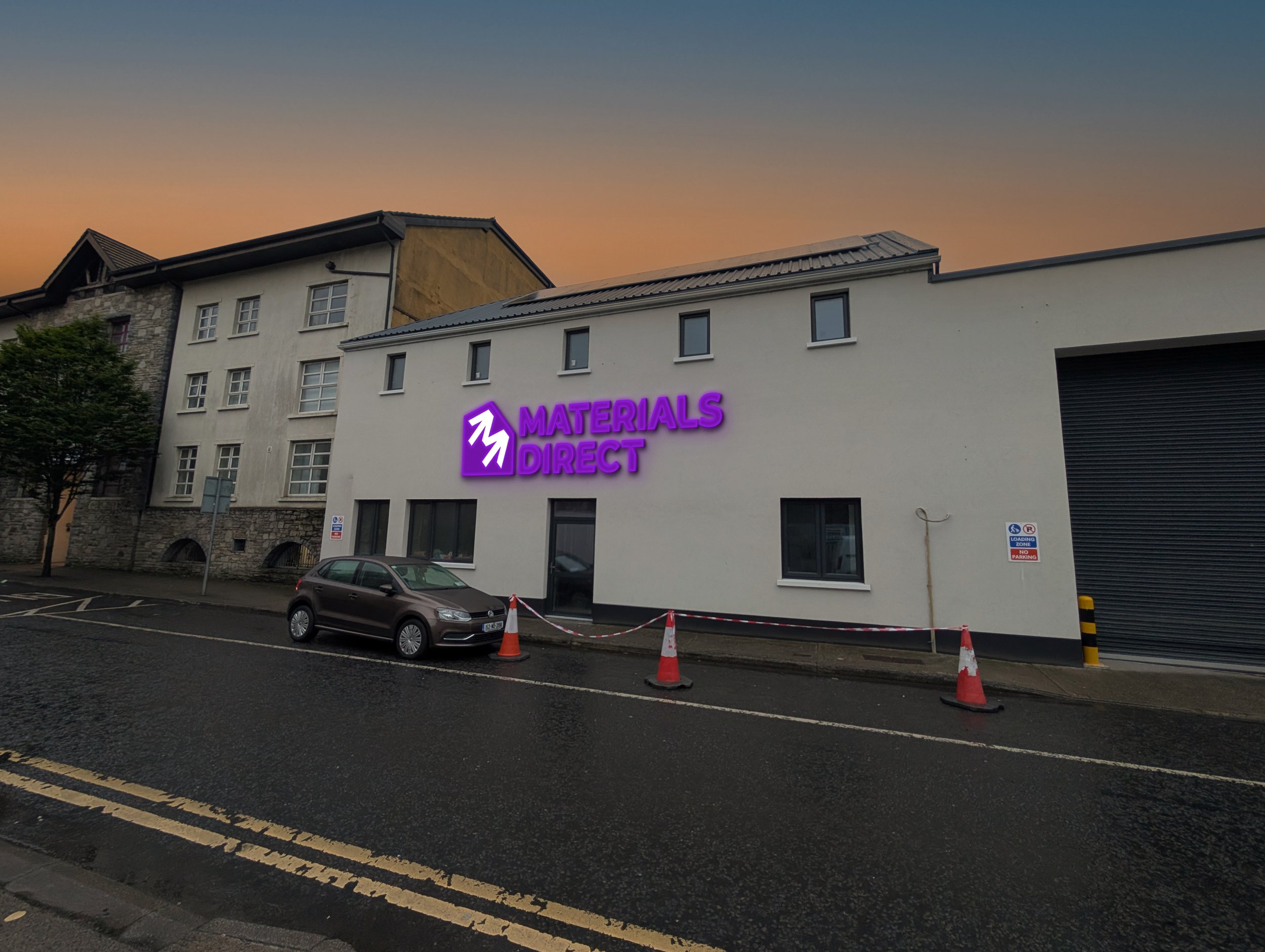
The final outcome represents the forward energy at the heart of Materials Direct. Two bold arrows combine to form an ‘M’ — a mark that captures both motion and meaning.
The arrows symbolise progress and pace, working together to reflect a brand that delivers with speed and strength.
The form is intentionally simple and geometric. Inspired by the timeless clarity of mid-century logo design, the mark draws from a time when logos were made to last: simple, strong, and recognisable in any context. This is identity reduced to what matters: form, function, and focus.
It is accompanied by a wordmark that carries forward the visual language of the Dual Arrows. It is bold, functional, and intentionally distinctive. Built for legibility at every scale, with just enough character to feel designed, not generic.
It’s not just typography; it’s part of the system. Designed to sit beside the mark or stand confidently on its own.