
The Project League is an ongoing collection of fictional football clubs inspired by places, people and popular culture. Each club is built from the ground up, combining storytelling, branding and sportswear design to create authentic football identities. From local landscapes to iconic television and film worlds, every project explores how colour, symbolism and kit design can shape the character of a football club.
Designer: Patrick Lindsay
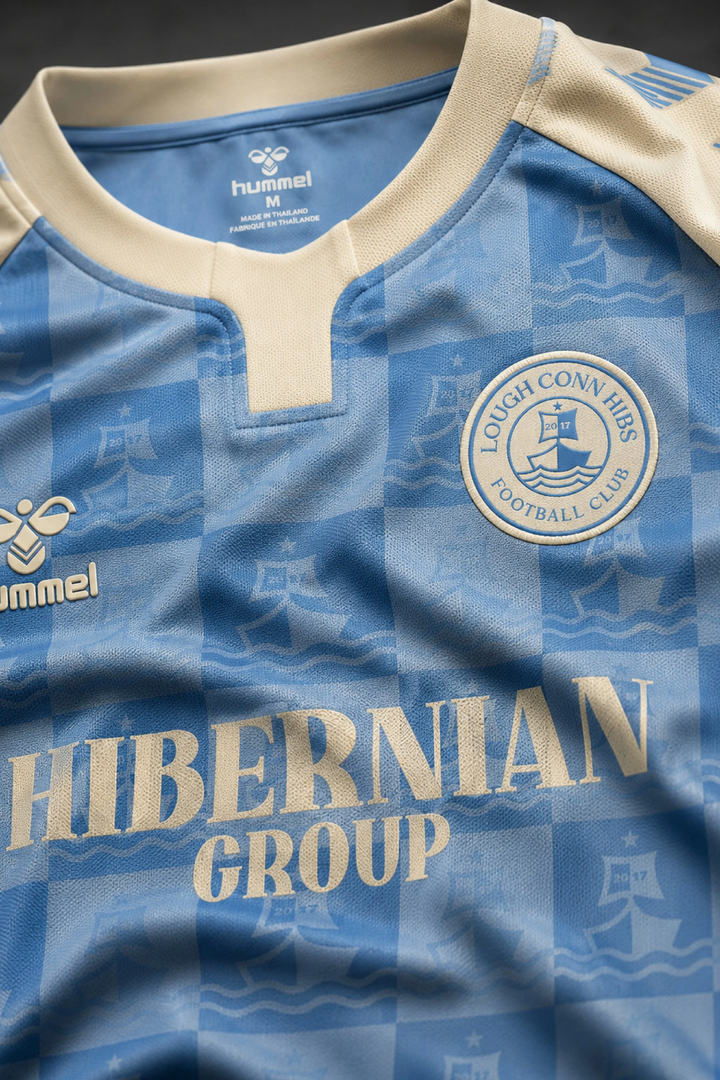
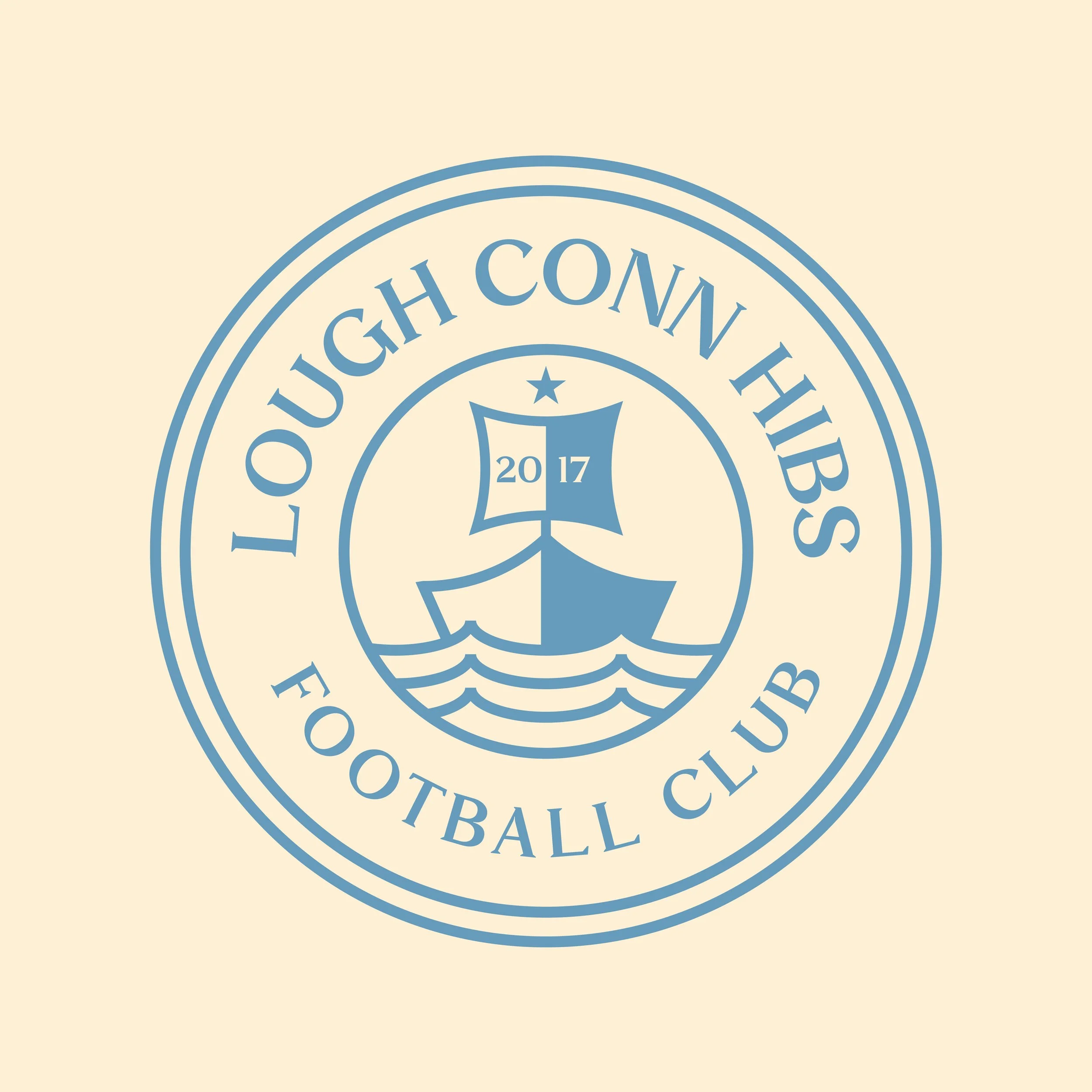
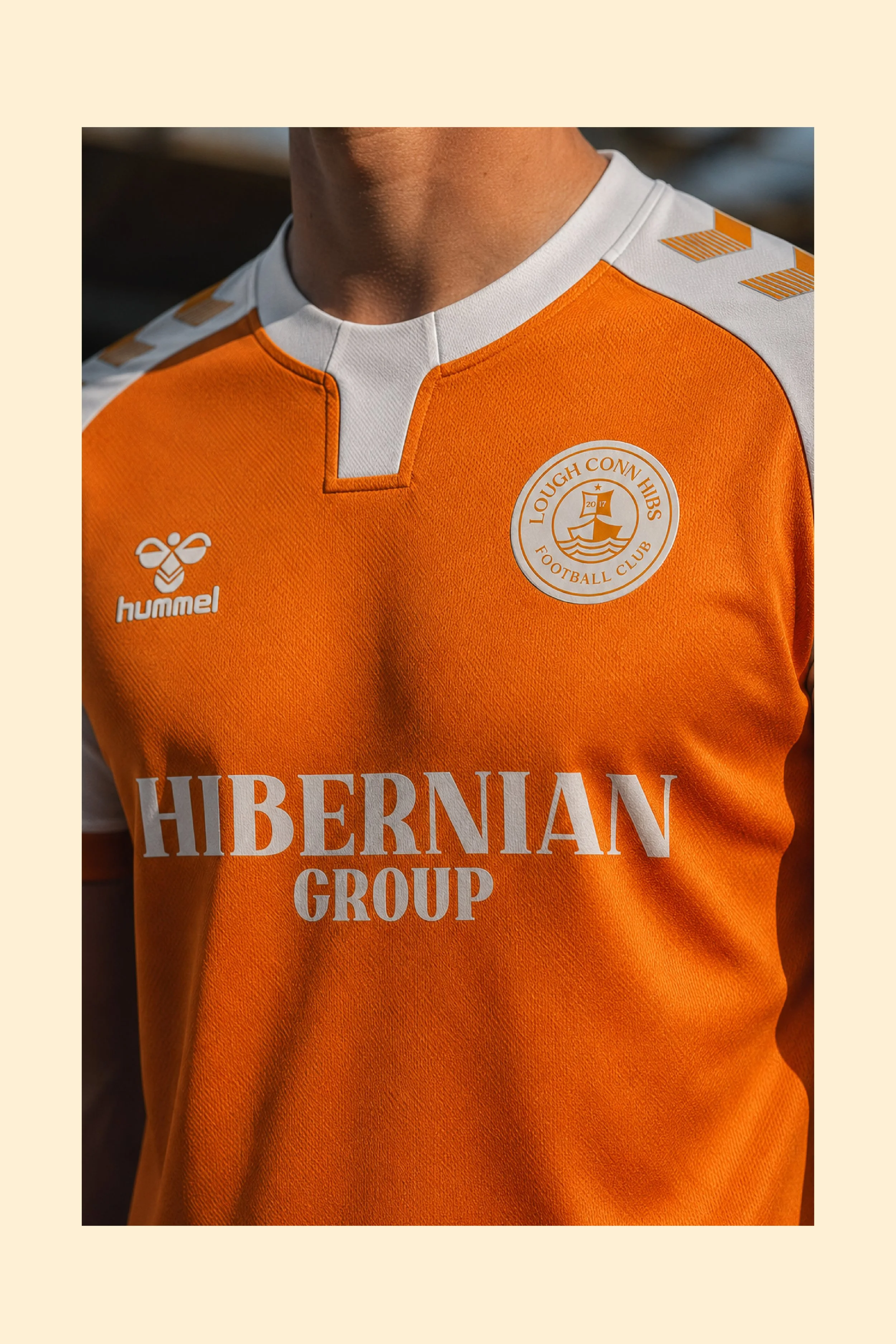
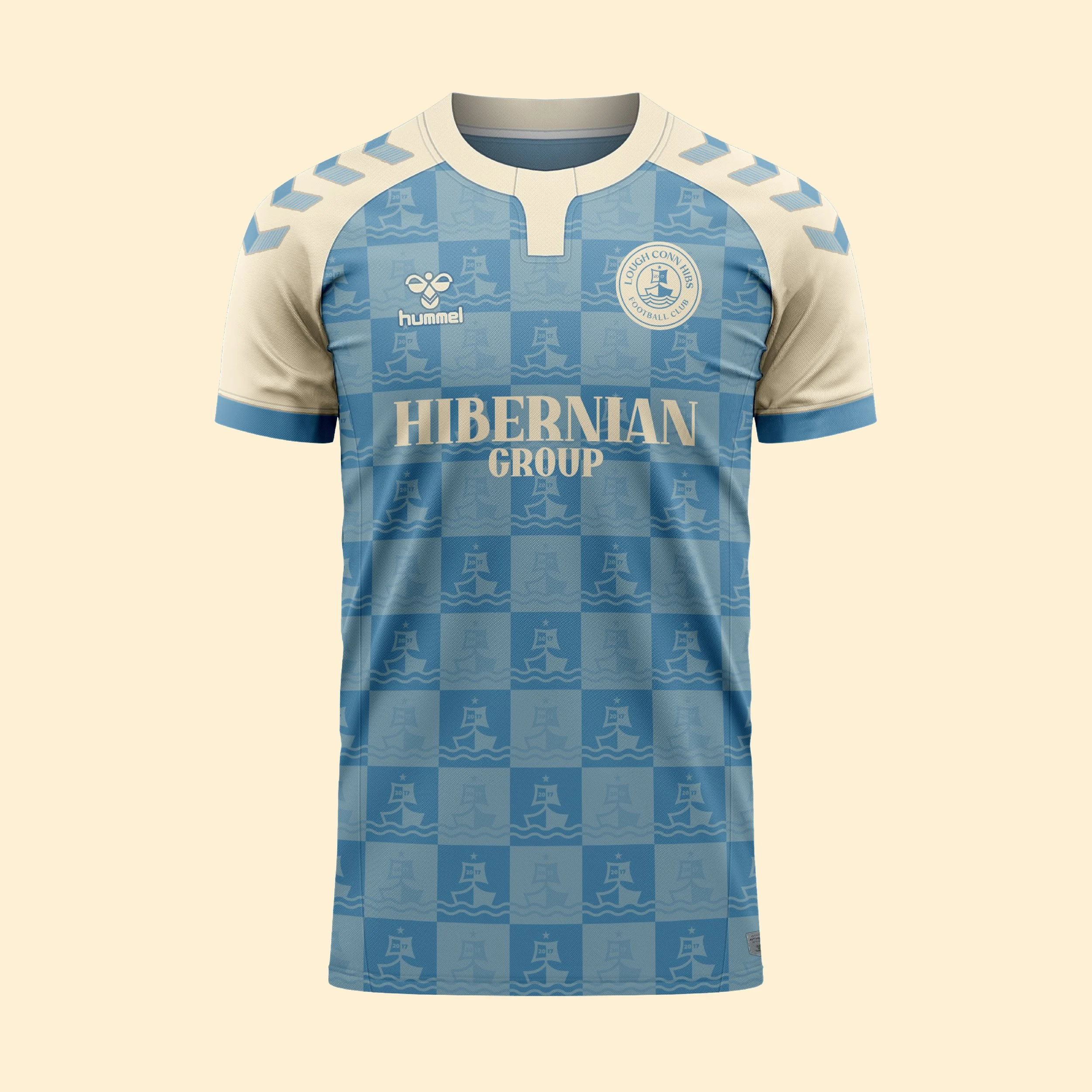
Nestled on the shores of Lough Conn in County Mayo, Lough Conn Hibs FC draws its identity from the landscape, heritage and natural beauty that surround the club. The crest features a traditional boat sailing across the waters of the lake - a symbol of the area's long standing connection to fishing, travel and community life. The club's colours are inspired by the natural tones of Lough Conn itself, reflecting the blues of the water.
Kit Design
The home shirt combines the soft blue and cream tones inspired by the waters of Lough Conn and the light that reflects across its surface throughout the year. The subtle checkered pattern incorporates elements taken directly from the club crest, repeating the iconic boat motif in a refined and understated manner.
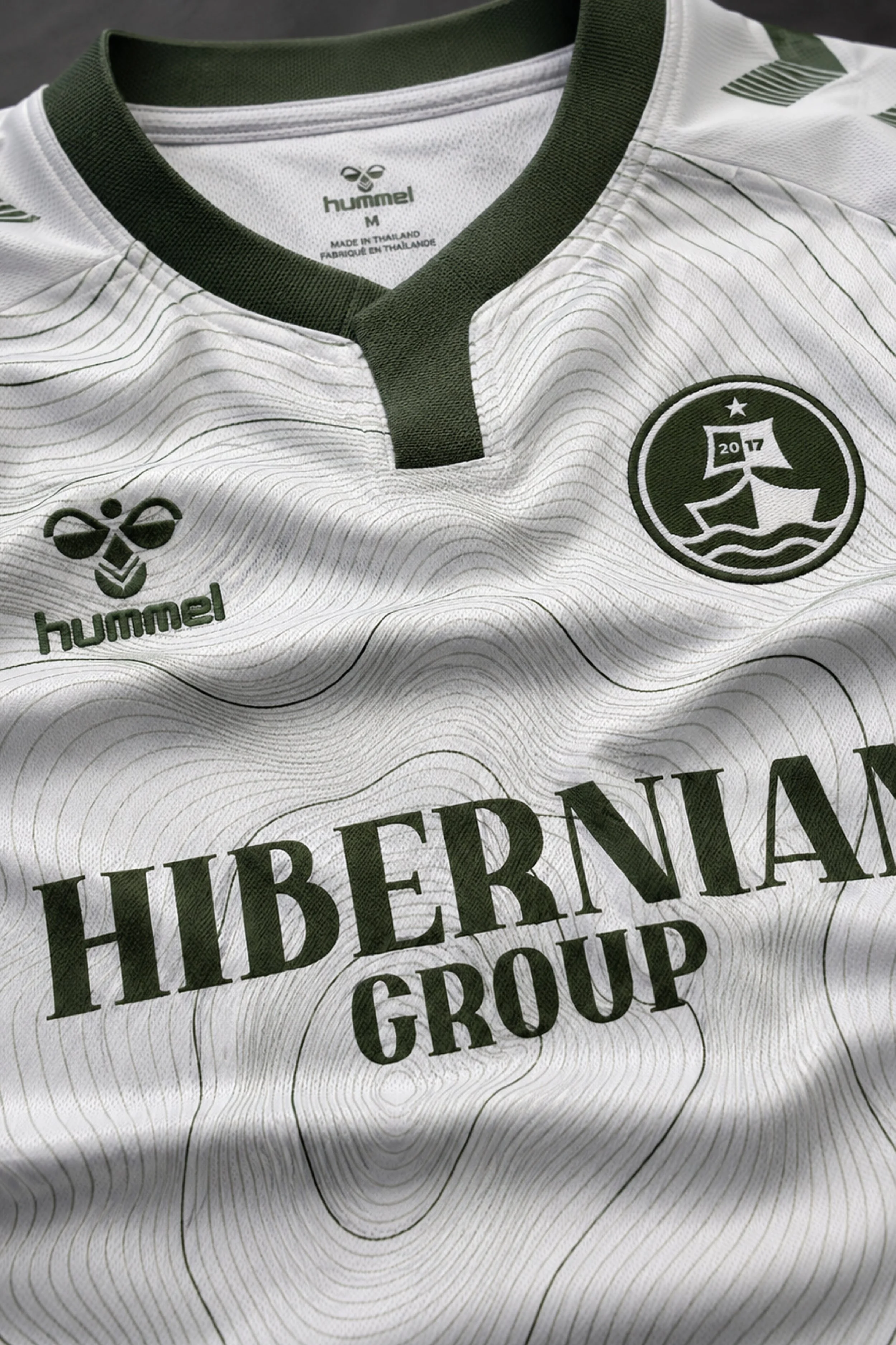
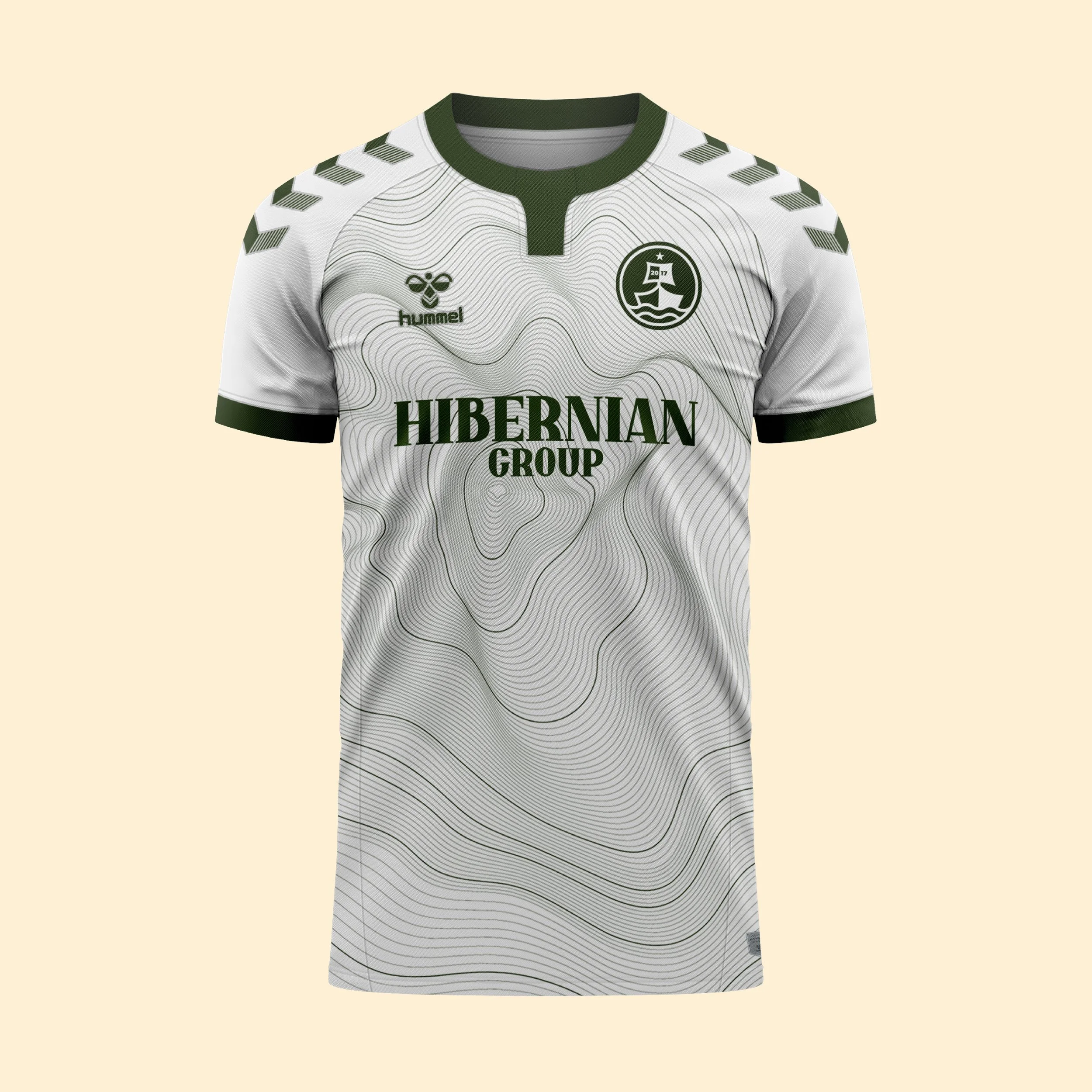
The away shirt takes inspiration from the rolling green landscape that surrounds Lough Conn. A crisp white base is overlaid with flowing contour lines derived from Nephin Mountain, the distinctive peak that overlooks the lake and much of the surrounding region. Completing the design is a simplified monochrome version of the club crest, offering a modern interpretation of the badge while allowing the landscape-inspired graphics to take centre stage.
The third shirt is influenced by the rich wildlife that inhabits the woodlands and shorelines around Lough Conn. Its warm orange tones pay homage to the foxes frequently spotted throughout the area, while the white detailing provides balance and contrast.
Club: Lough Conn Hibs FC
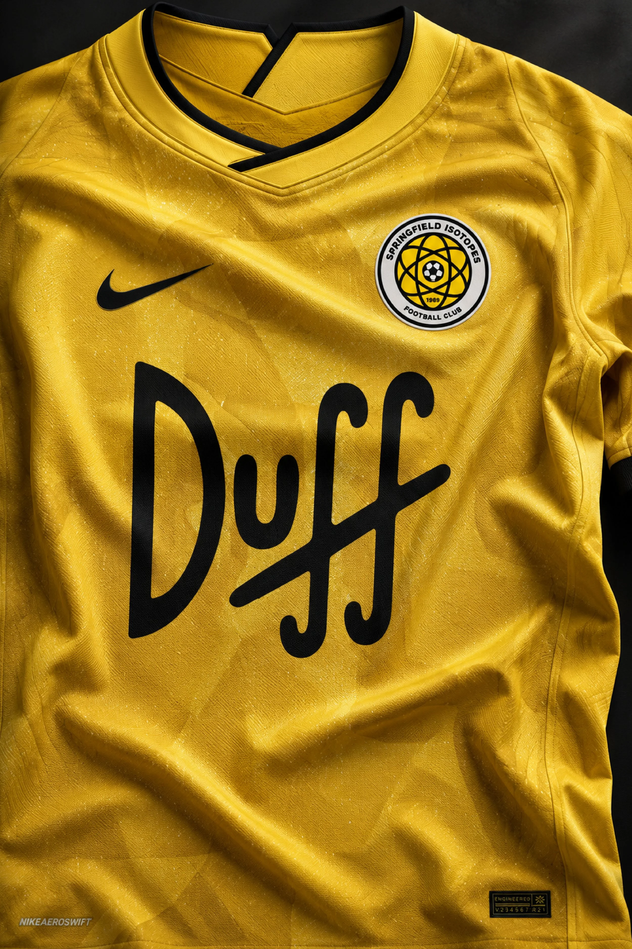
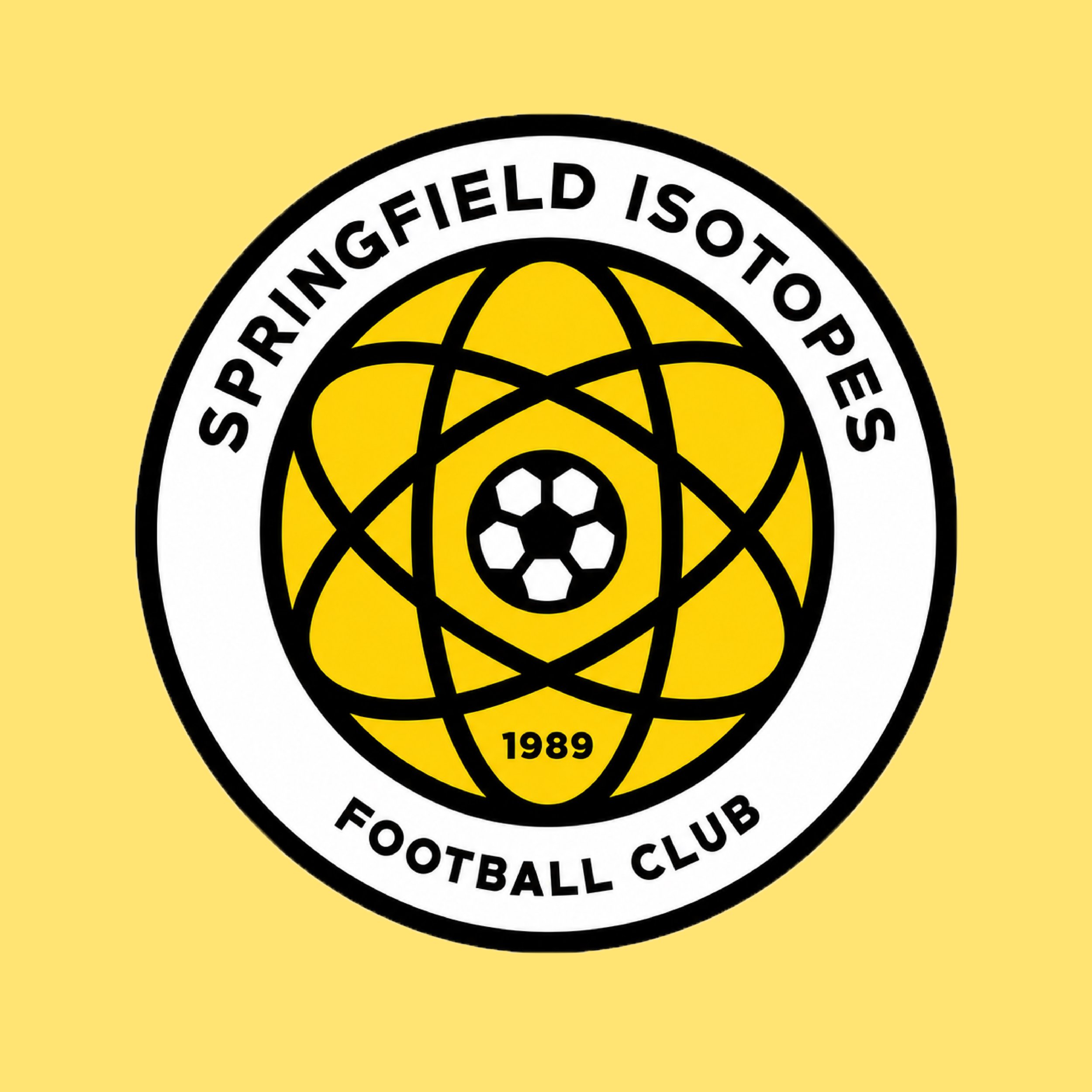
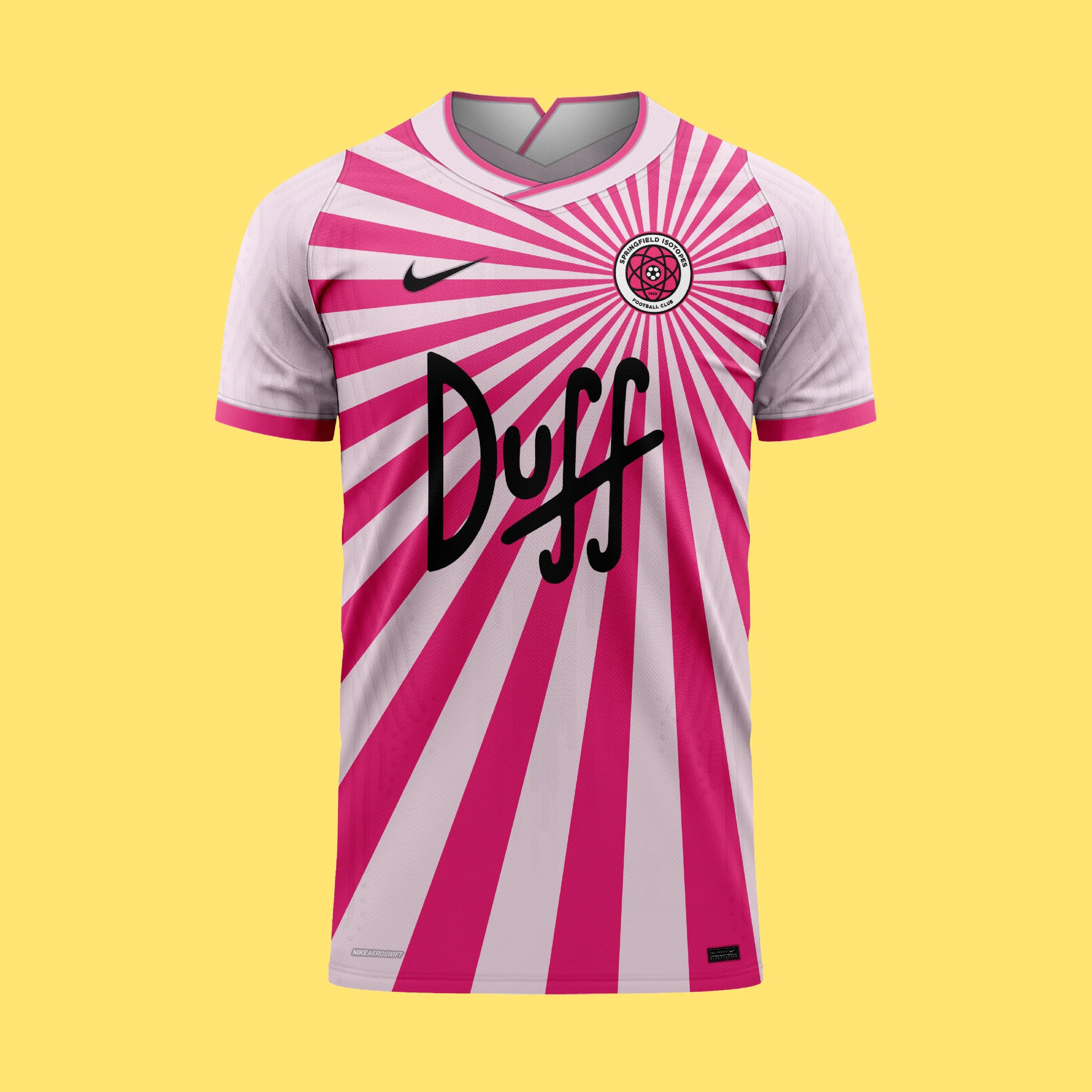
Inspired by the fictional baseball team from The Simpsons, Springfield Isotopes FC reimagines the club as a modern football team. The club crest centres around an atomic symbol, referencing both the team's name and Springfield Nuclear Power Plant, one of the show's most iconic locations. The colour palette draws influence from the characters skin tone becoming instantly recognisable to fans of the series.
Kit Design:
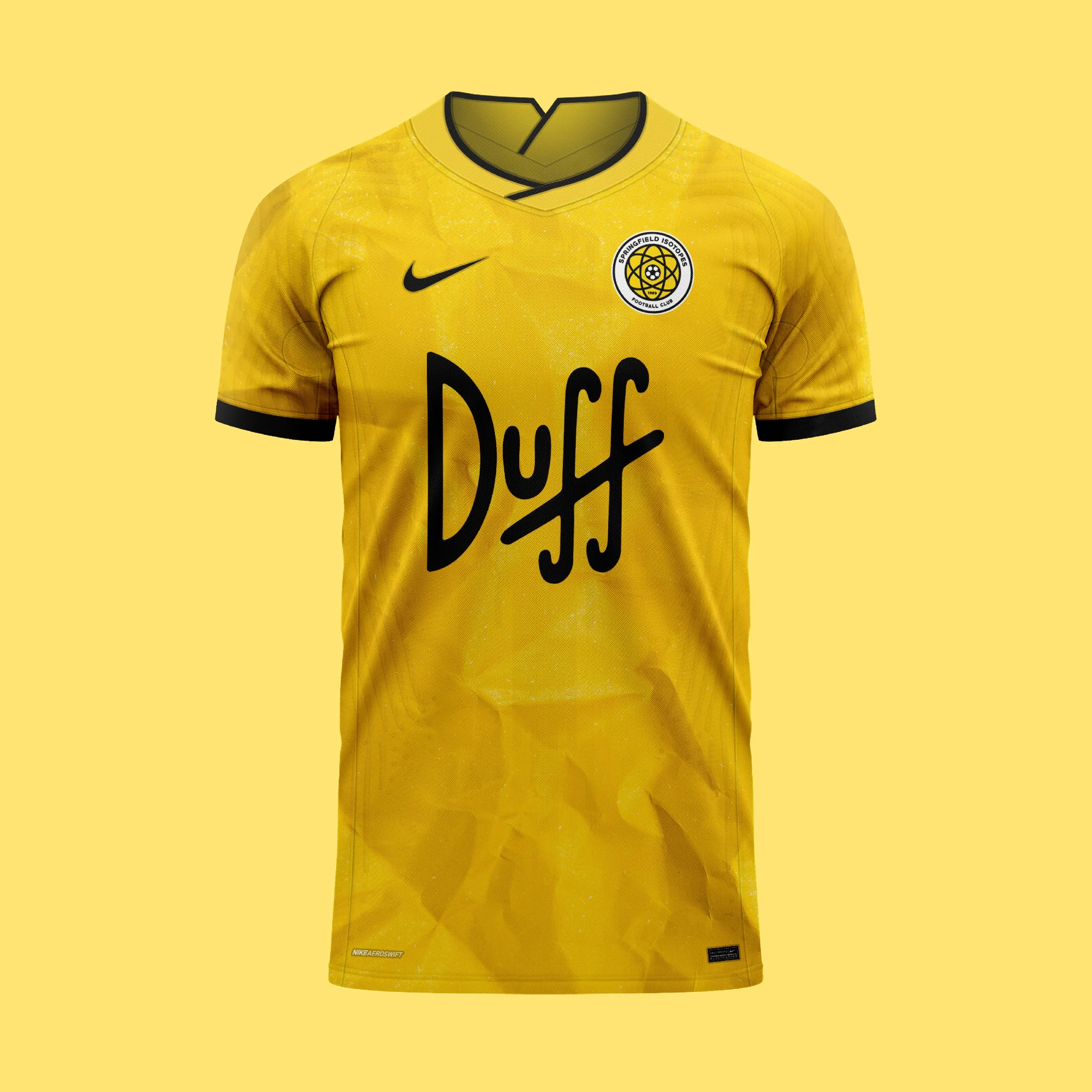
The home shirt adopts Springfield's iconic yellow colour, creating an immediate connection to the visual identity of The Simpsons.
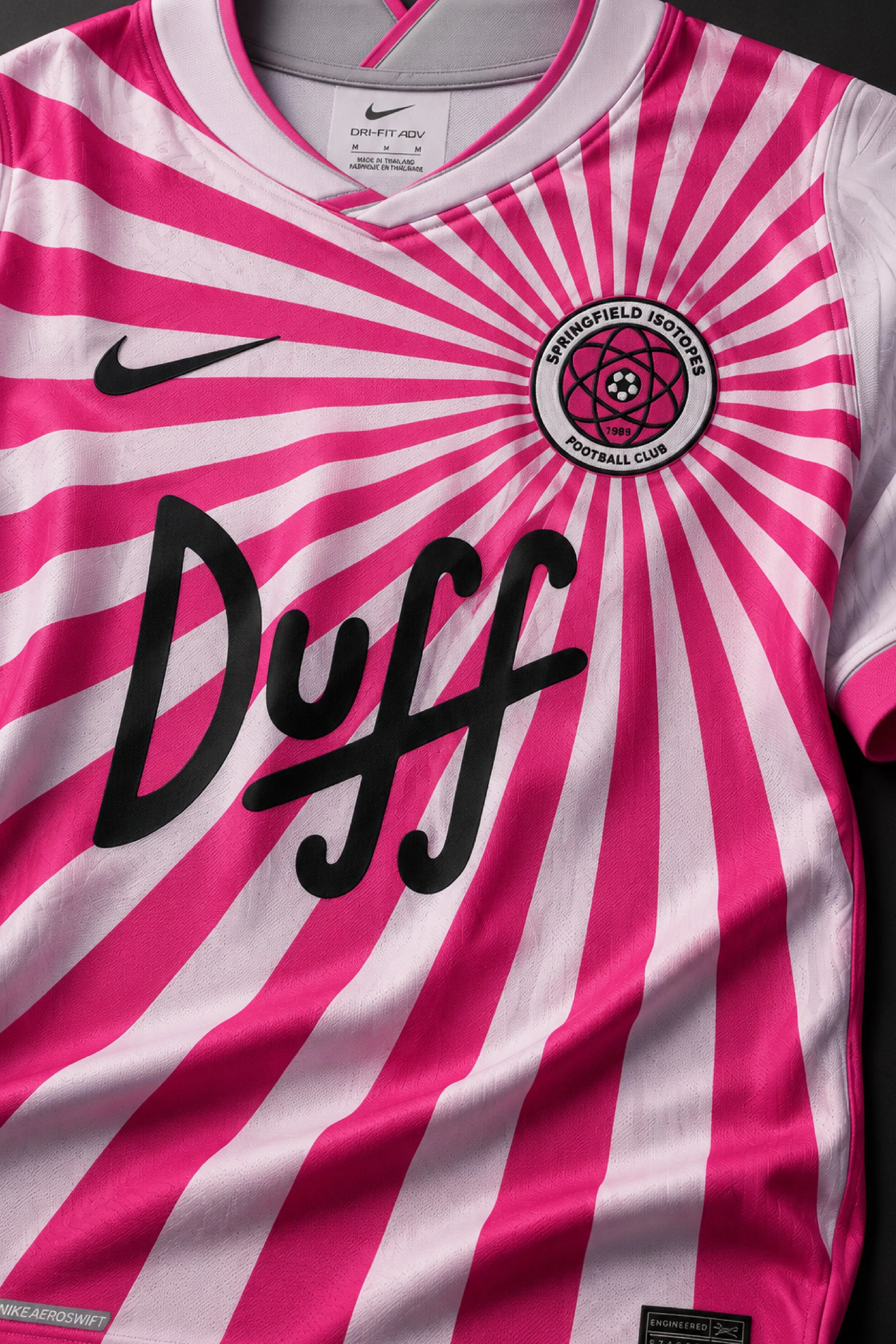
The away shirt references the "Mr. Sparkle" sequence from the episode Thirty Minutes Over Tokyo (1999), incorporating a pink rising-sun graphic inspired by the Japanese soap packaging seen in the episode.
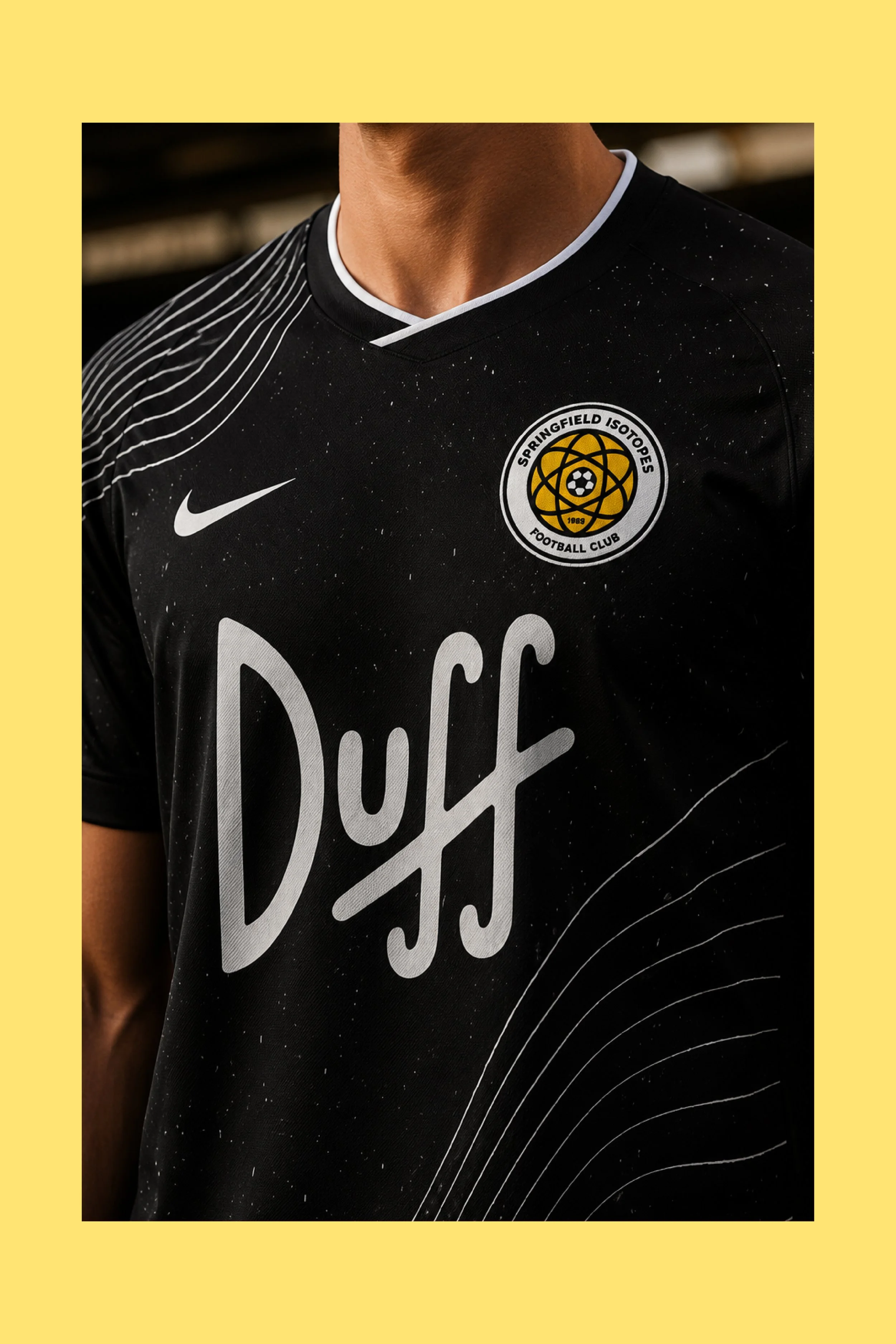
The third shirt takes inspiration from the night sky visible from Springfield Observatory, featuring a dark base with subtle star-like detailing and flowing contour lines.
Club: Springfield Isotopes FC
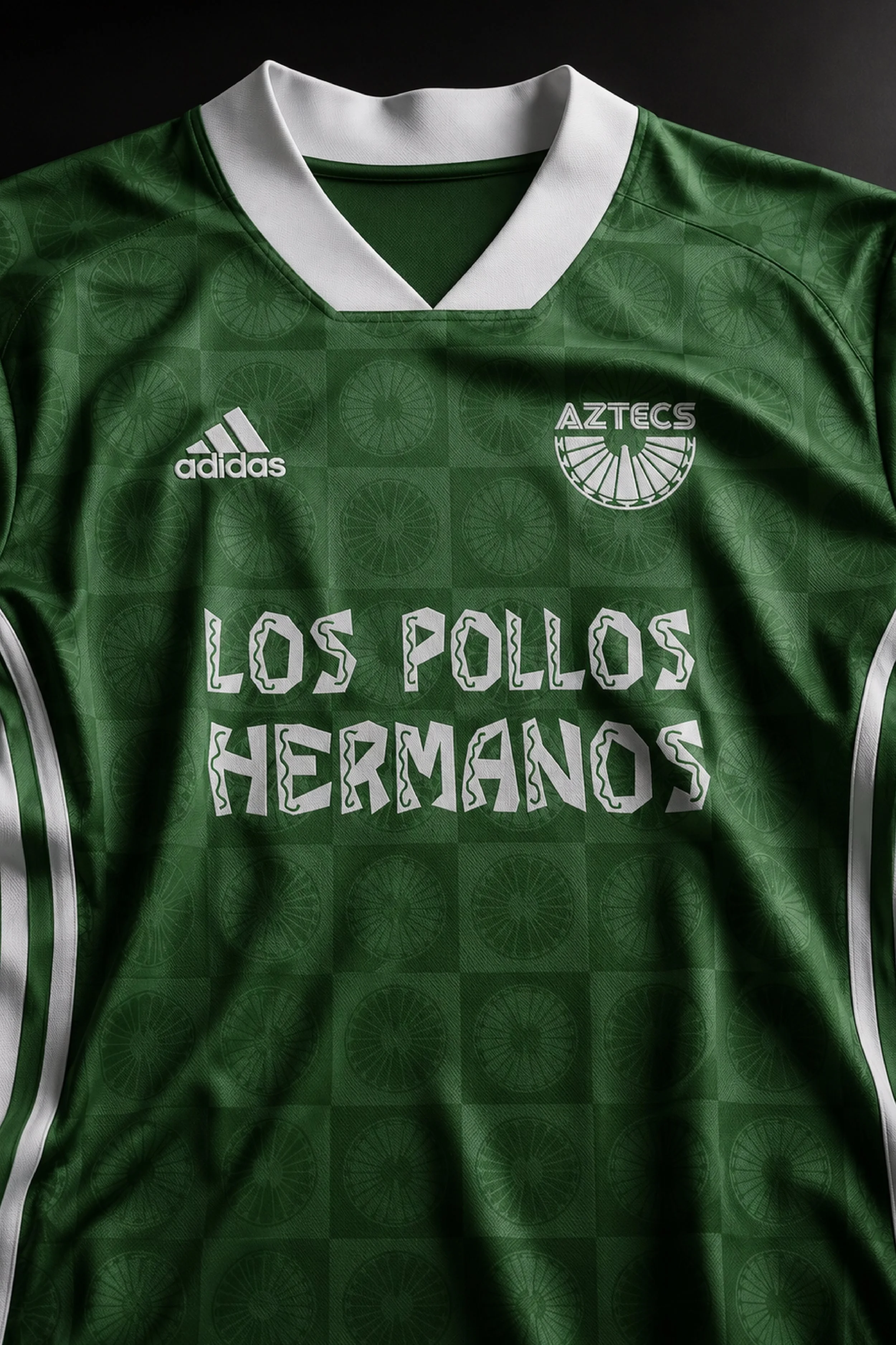
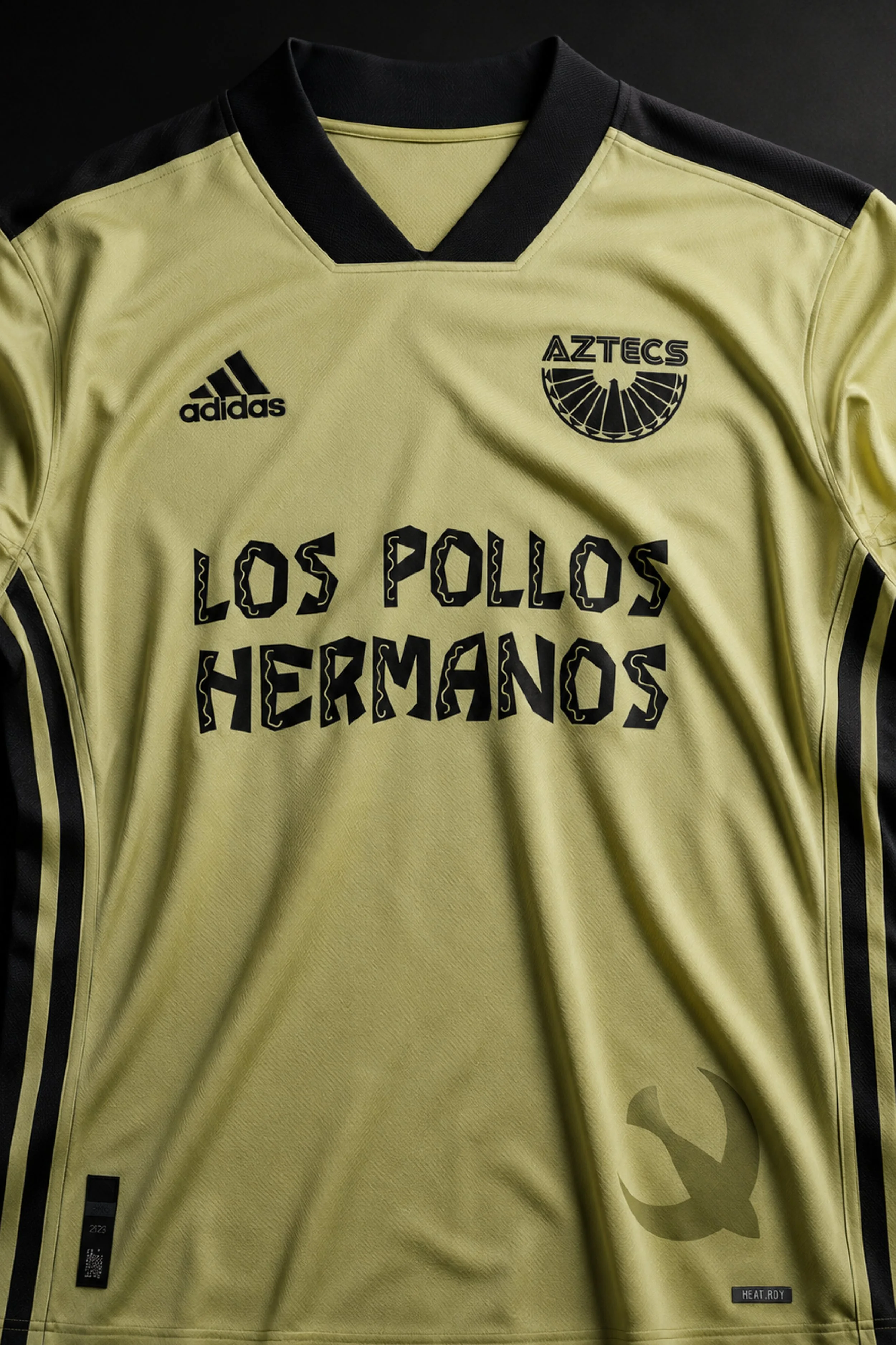
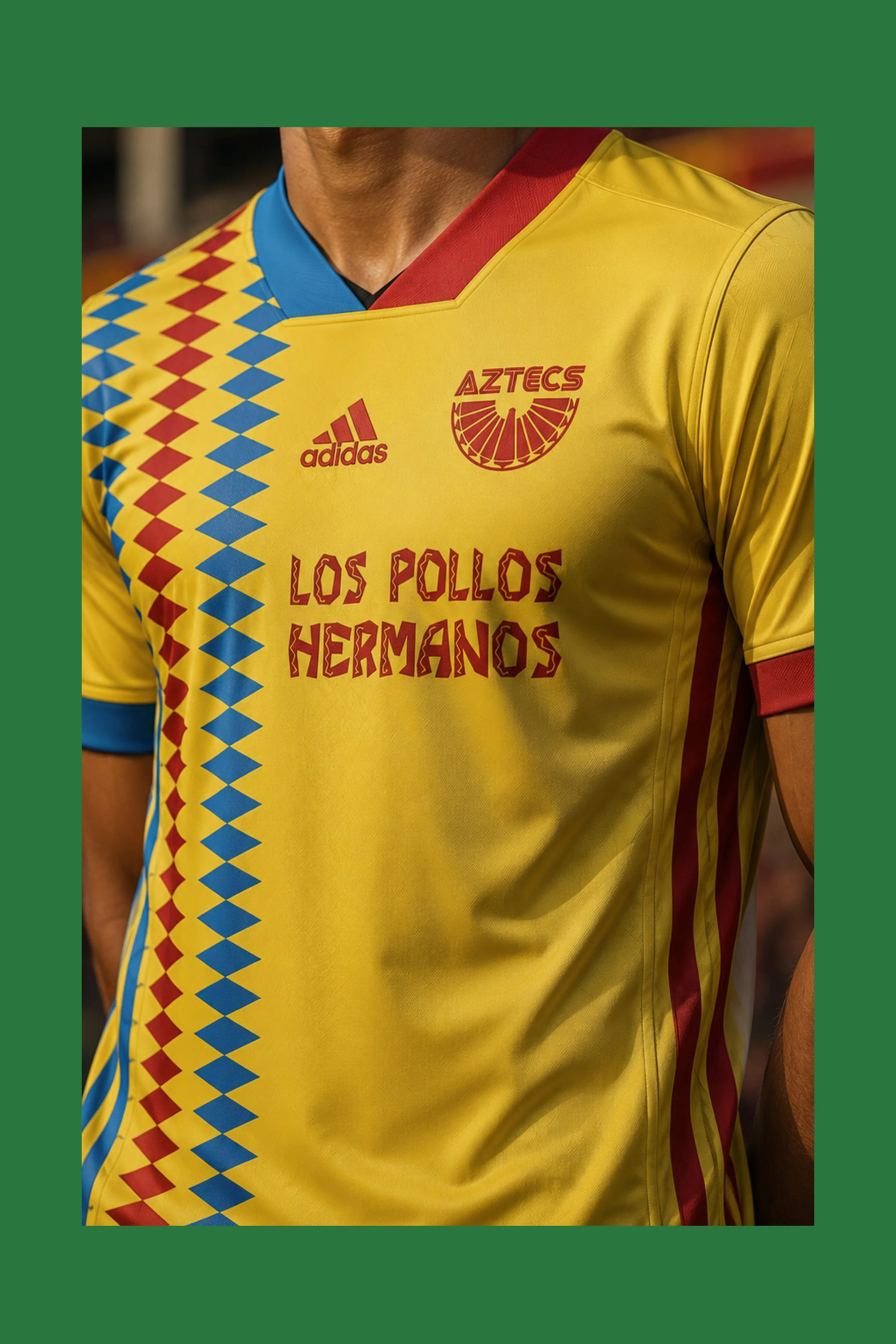
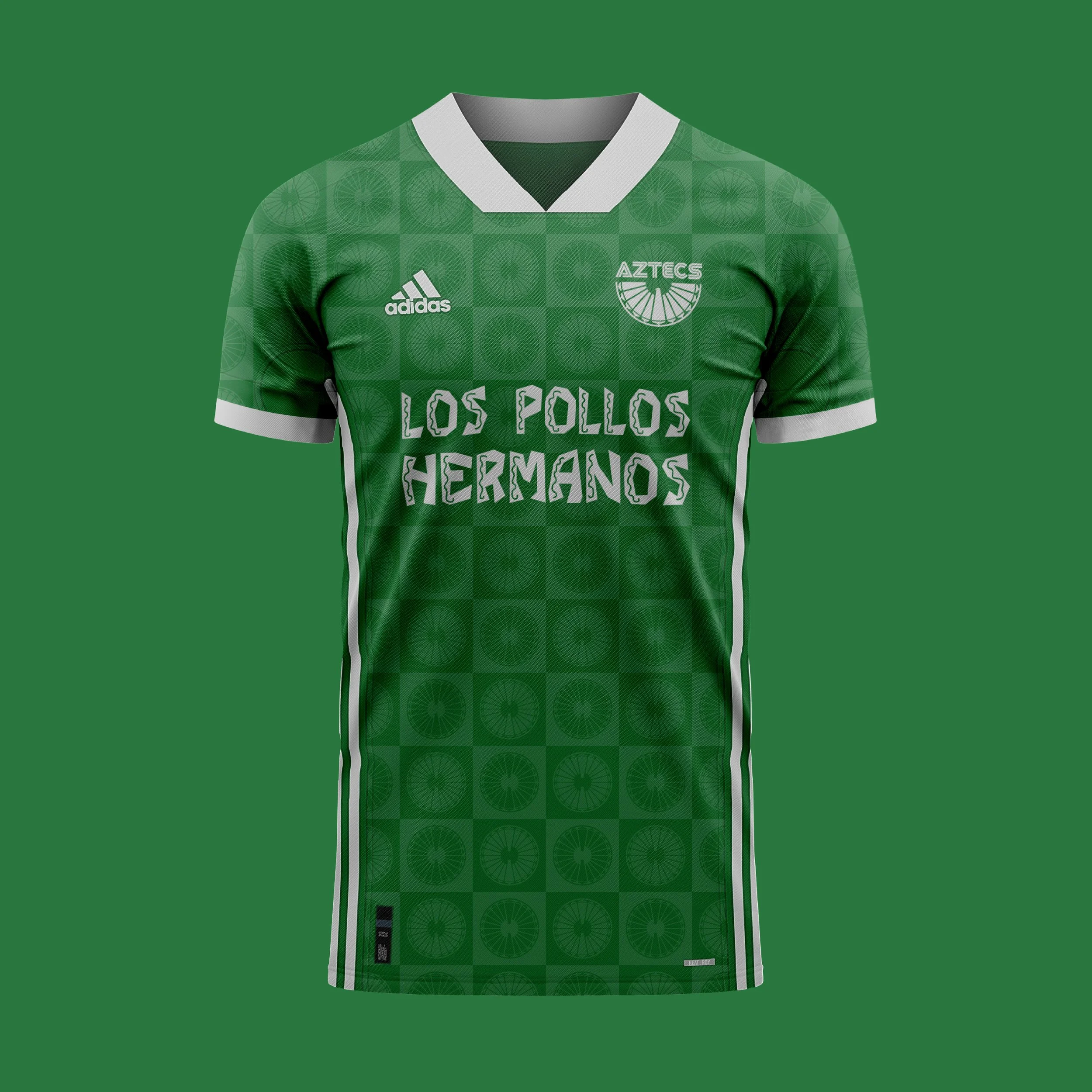
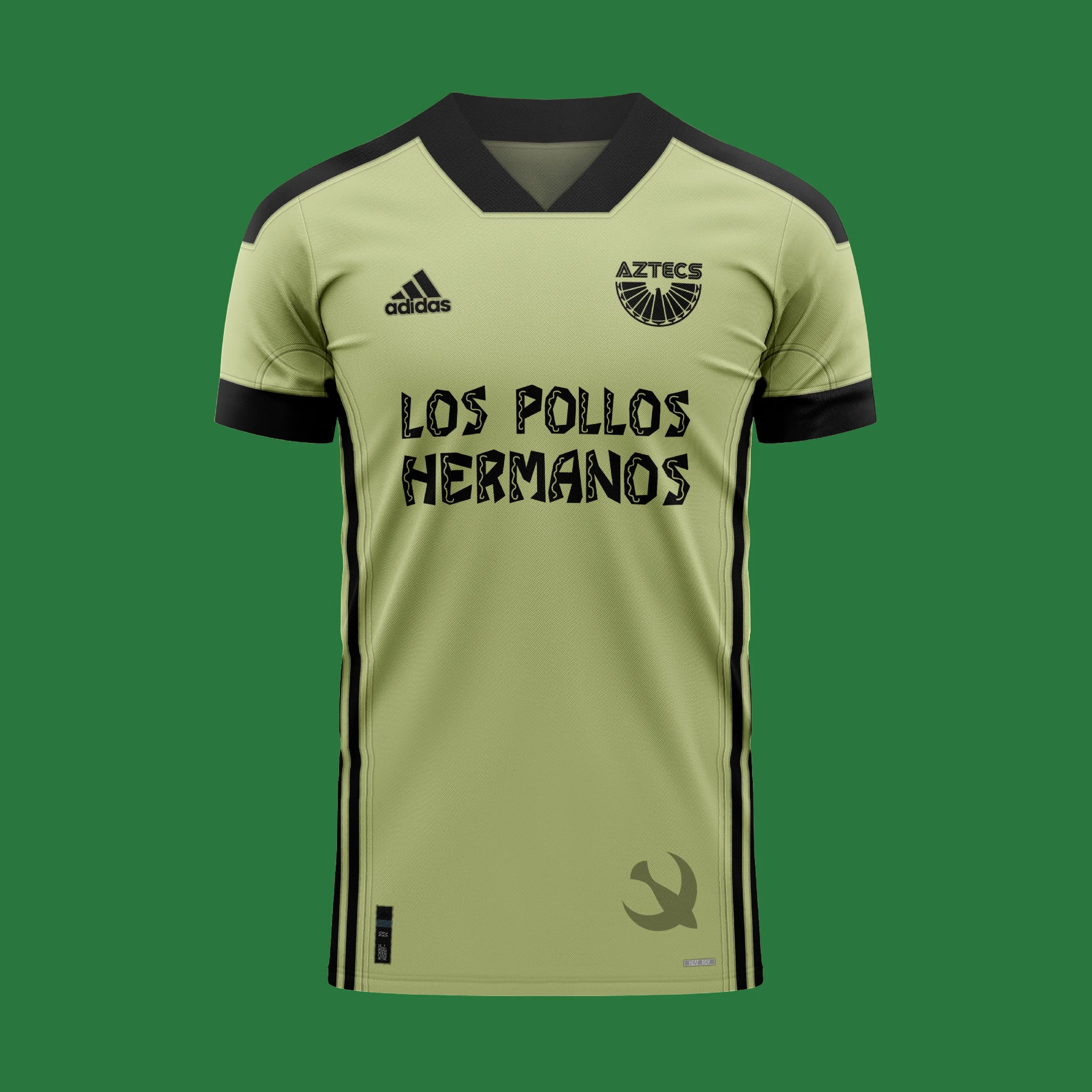
Albuquerque Aztecs FC is a football club inspired by the world of Breaking Bad and Better Call Saul, taking its name from the iconic Pontiac Aztec driven by Walter White throughout much of the Breaking Bad series. Based in Albuquerque, New Mexico, the club embraces the spirit of the high desert - resilient, resourceful and unmistakably different - blending Southwestern culture and landscape with a subtle tribute to one of television's most recognisable symbols of the city.
Kit Design:
The Home shirt draws inspiration from the iconic green associated with Breaking Bad, paired with aluminium grey accents inspired by the show's famous opening credits, which use chemical elements from the periodic table within the cast names. Taking inspiration from "Al" - the first two letters of Albuquerque - the design incorporates the element Aluminium throughout the trim and detailing. A subtle tonal pattern inspired by the Aztecs badge and the eagles commonly seen across New Mexico adds depth to the shirt while maintaining a clean and understated look
The Away Shirt is a direct tribute to the iconic Pontiac Aztec driven by Walter White throughout Breaking Bad, adopting the vehicle's distinctive desert-sand colour as the foundation of the design. Black trim reflects the mismatched black wheel famously seen on the car, adding an authentic detail familiar to fans of the series. Completing the look is a subtle Thunderbird graphic positioned near the hem, inspired by the Native American symbol featured on Albuquerque's city flag - a respectful nod to the region's history and cultural heritage.
The Third Shirt draws inspiration from the vibrant colours of Albuquerque's city flag in a bold design that reflects the city's identity. The repeating geometric pattern references traditional Indigenous textile motifs and the stepped forms found throughout Southwestern and Pueblo art, celebrating the rich cultural heritage of New Mexico.
Club: Albuquerque Aztecs FC

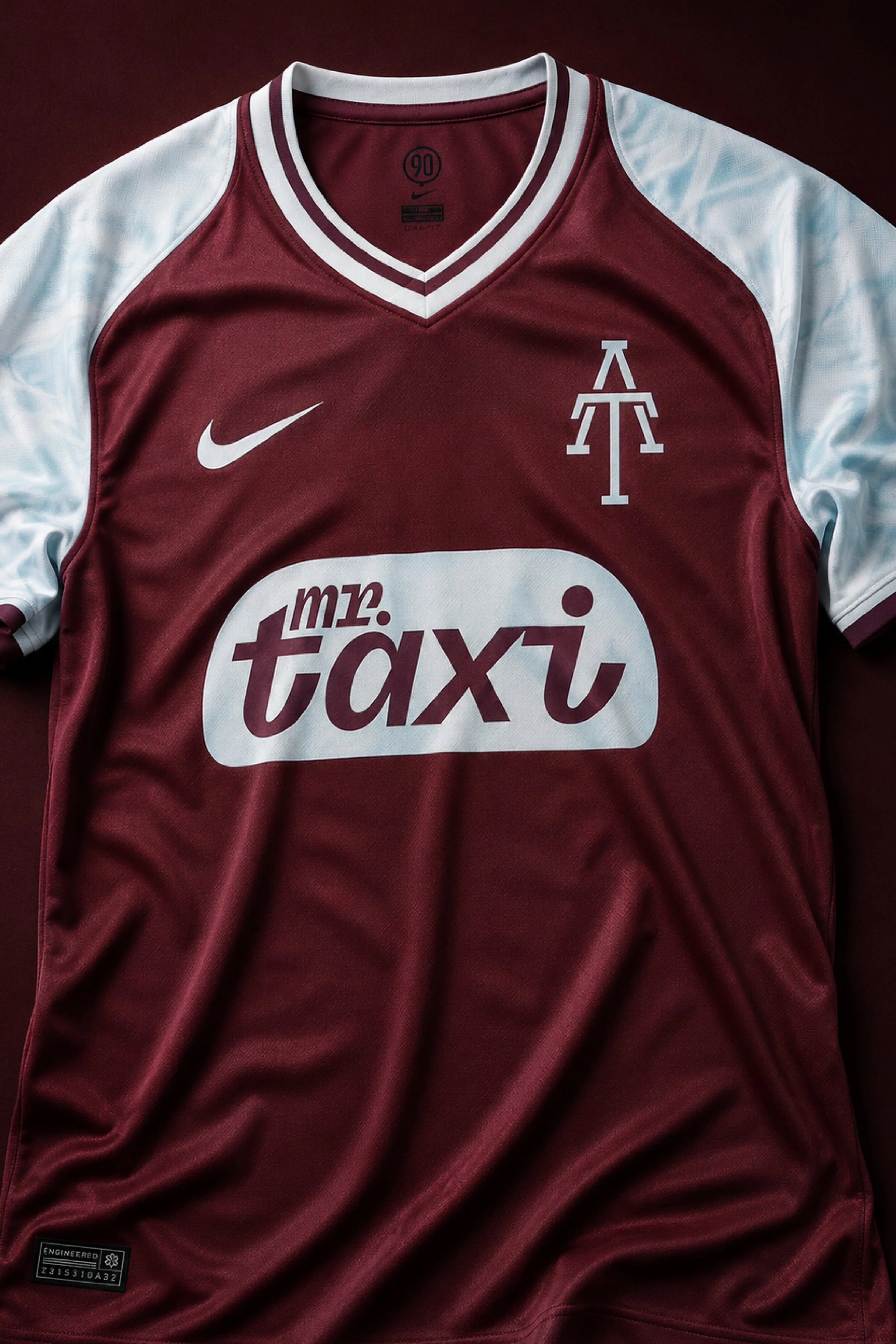
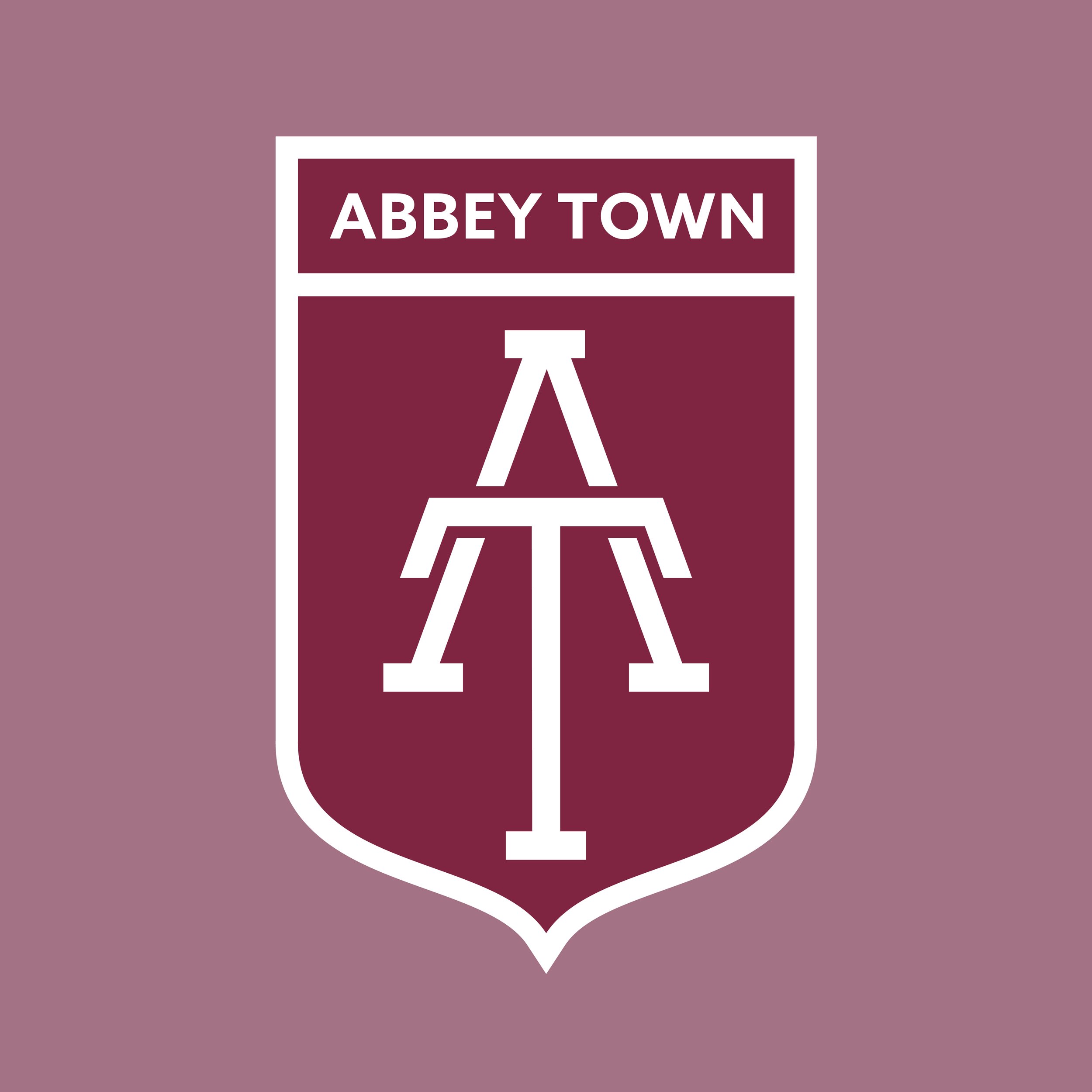
Abbeytown FC is a football club representing the Abbeytown area of Crossmolina, Co. Mayo. Rooted in a close-knit community and local football tradition, the club takes pride in representing one of the town's best-known neighbourhoods. A longstanding rival of Abbey View FC, both clubs are considered the home of football in the region, with generations of players, supporters and families helping to shape the game's strong presence within the community.
Kit Design:
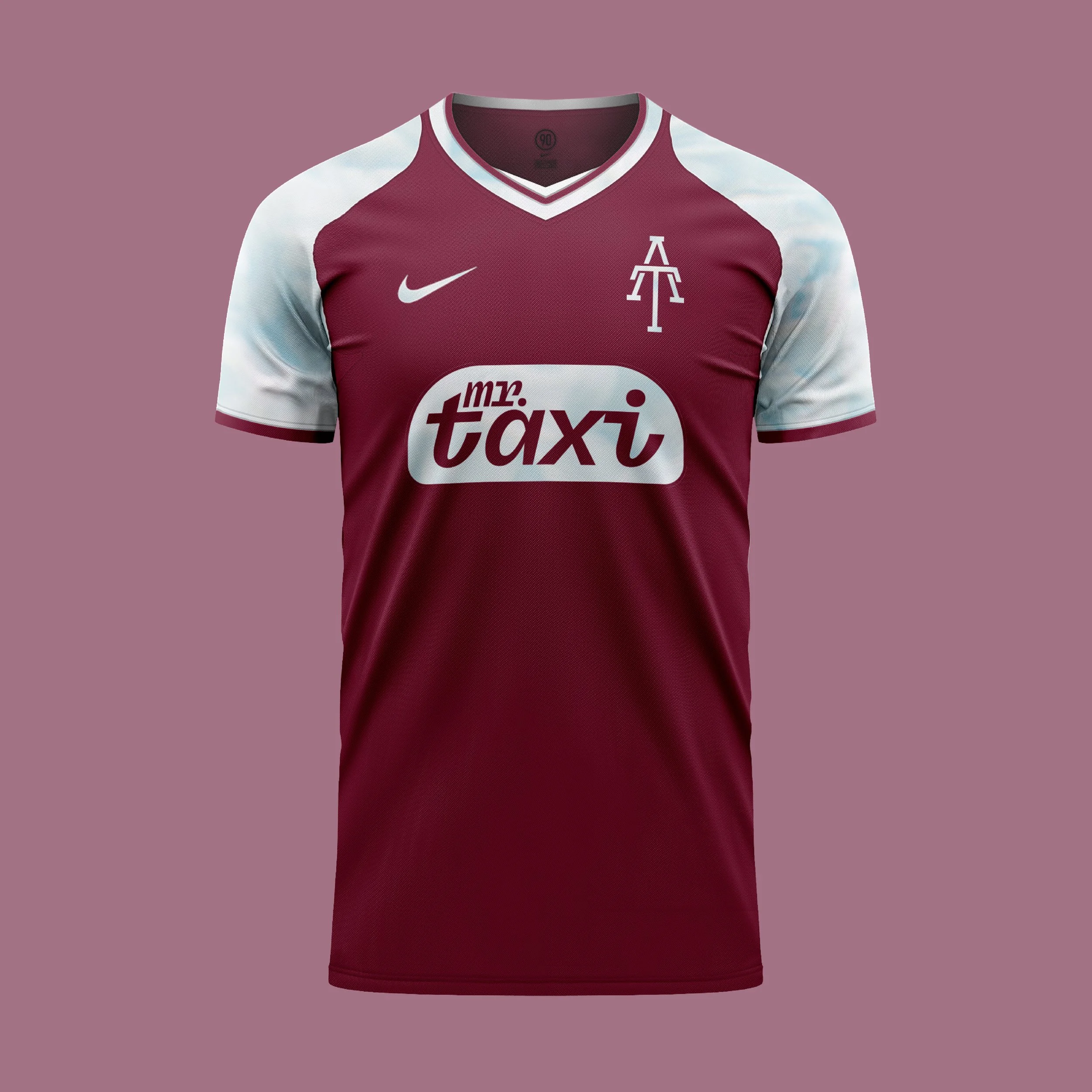
The Home Shirt pays tribute to the colours most closely associated with football in Crossmolina, combining a rich maroon body with white and claret detailing inspired by Crossmolina AFC. The clean, traditional design reflects the identity of the local community, blending familiar colours with a modern football aesthetic to create a kit that feels proudly rooted in its Mayo home.
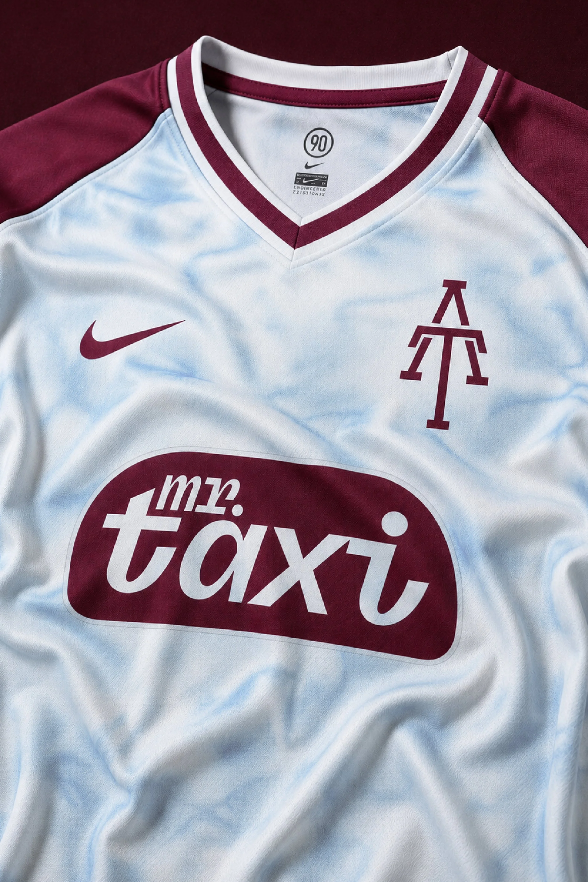
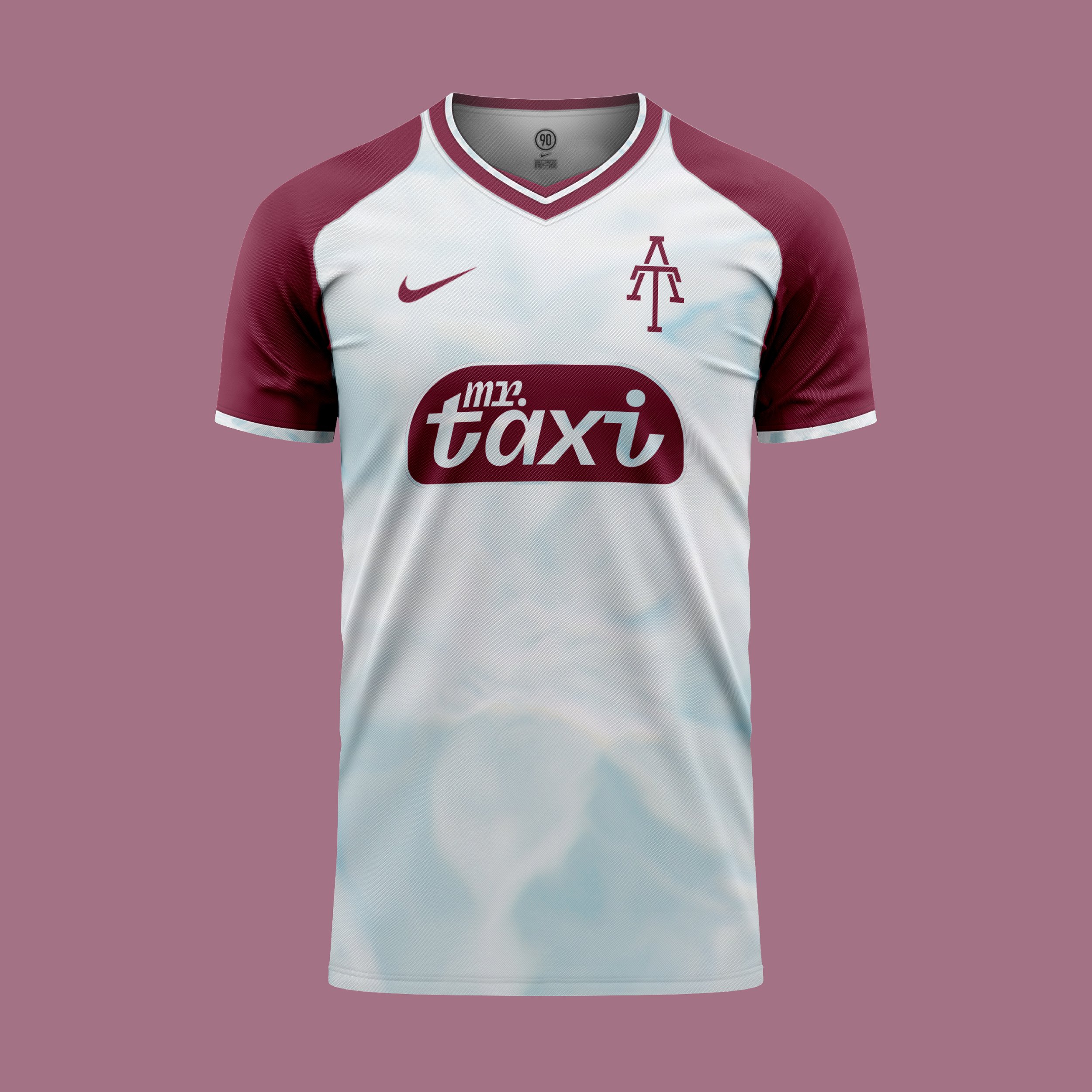
The Away Shirt takes the colours of the Home Shirt and reverses them, placing white at the centre of the design while retaining the club's distinctive maroon identity.
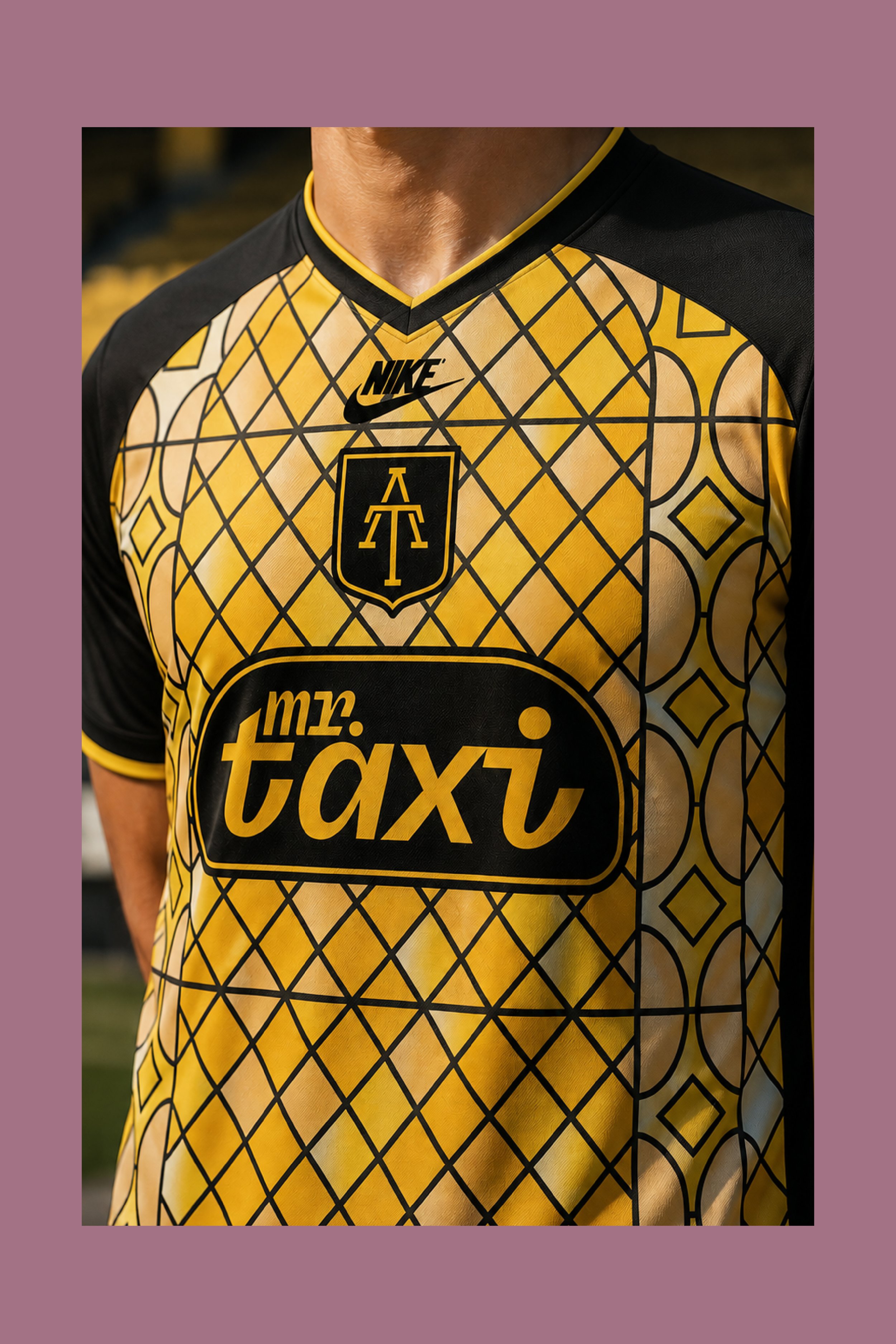
The Third Shirt celebrates one of Abbeytown FC's longest-standing supporters and sponsors, Mr Taxi, with a colour palette inspired directly by the company's iconic black and gold branding. The geometric pattern across the shirt draws inspiration from the stained-glass windows of St. Mary's Church, a landmark that overlooks the neighbourhood and has long been part of the area's identity.
Club: Abbeytown Football Club
Abbey View FC is a football club representing the Abbey View area of Crossmolina, Co. Mayo. Built on strong community spirit and a deep passion for the game, the club has played an important role in local football for generations. Like rivals Abbeytown FC, Abbey View is part of a proud football tradition that has helped establish the area as the heartland of the sport in the region, producing countless players, supporters and memorable local rivalries over the years.
Kit Design:
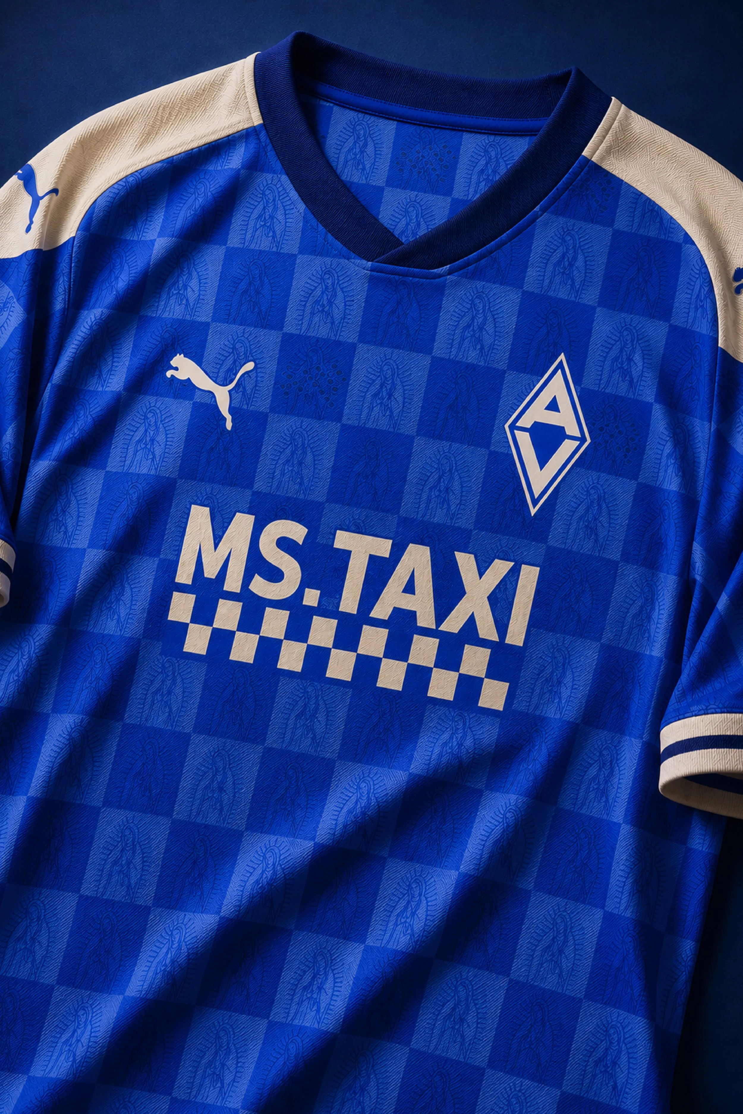
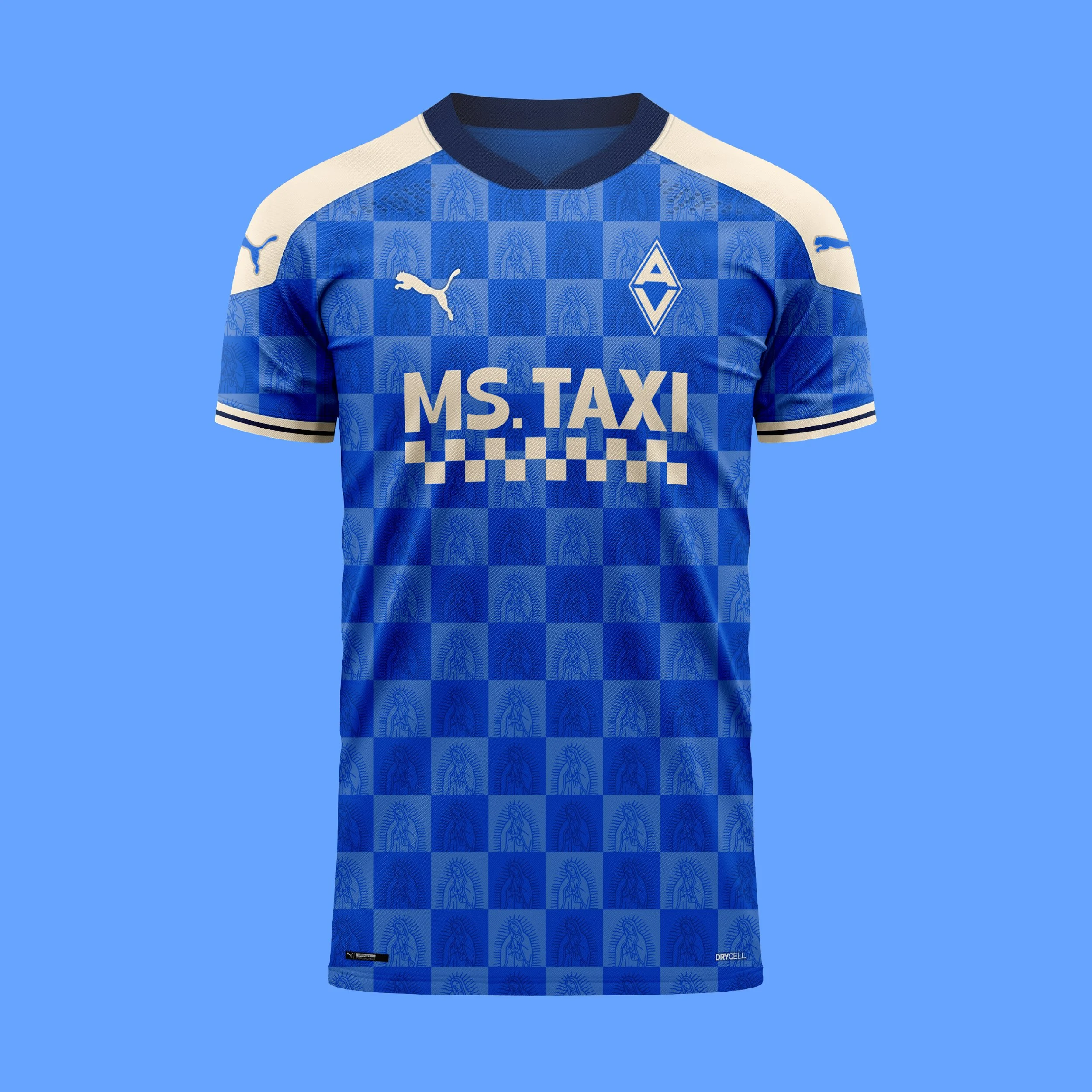
The Home Shirt celebrates Abbey View FC's identity through its traditional blue colours. The subtle checkerboard pattern features imagery of the Virgin Mary, inspired by the artwork found within St. Tiernan's Church, a landmark that has stood at the heart of the community for generations.
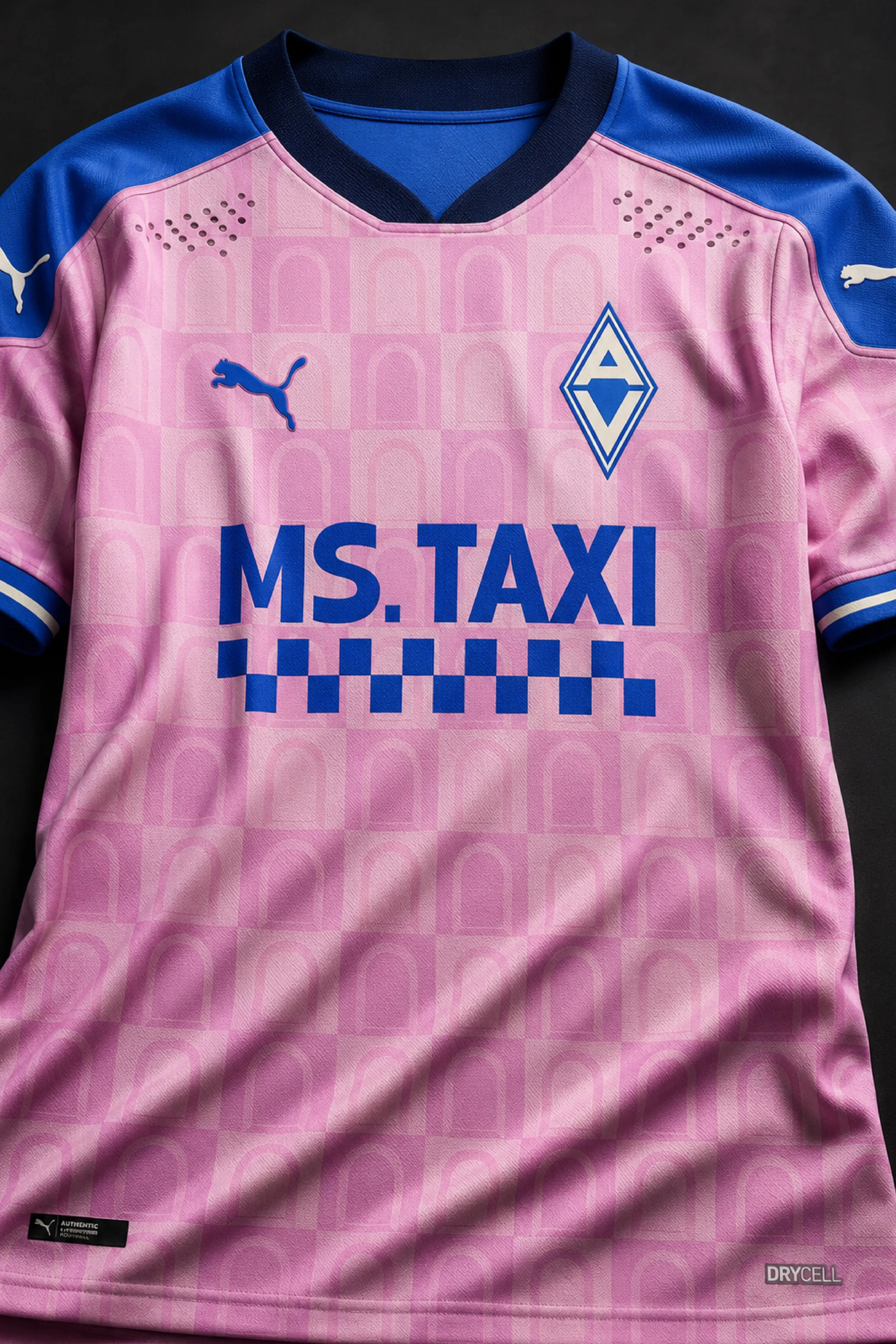
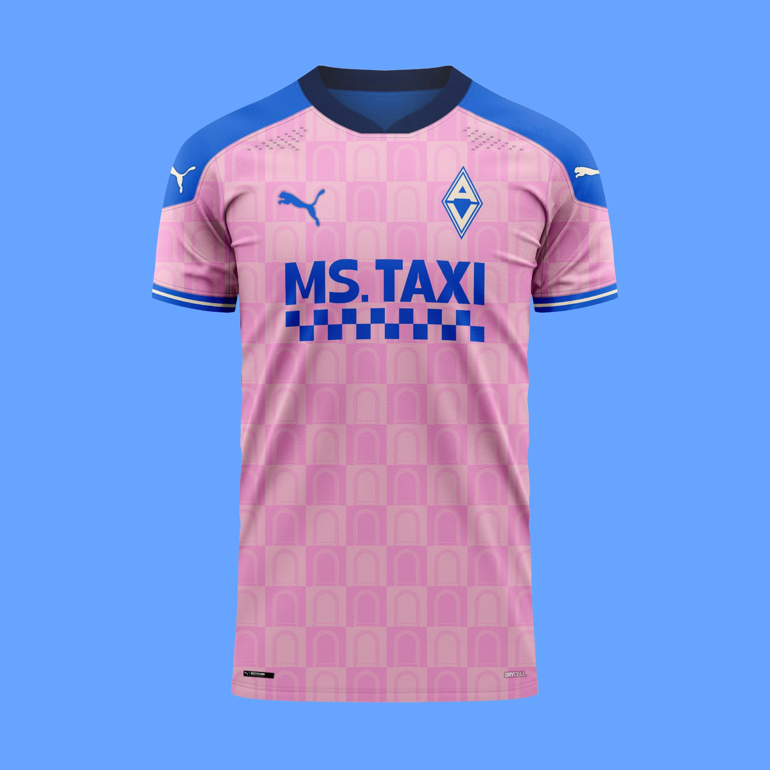
The Away Shirt draws inspiration from the historic abbey that gave Abbeytown its name. Its repeating pattern mirrors the distinctive arched windows of the old abbey ruins, creating a design that pays tribute to one of the area's most recognisable landmarks. Finished in a striking pink and blue colour combination, the shirt offers a modern interpretation of Abbeytown's rich history.
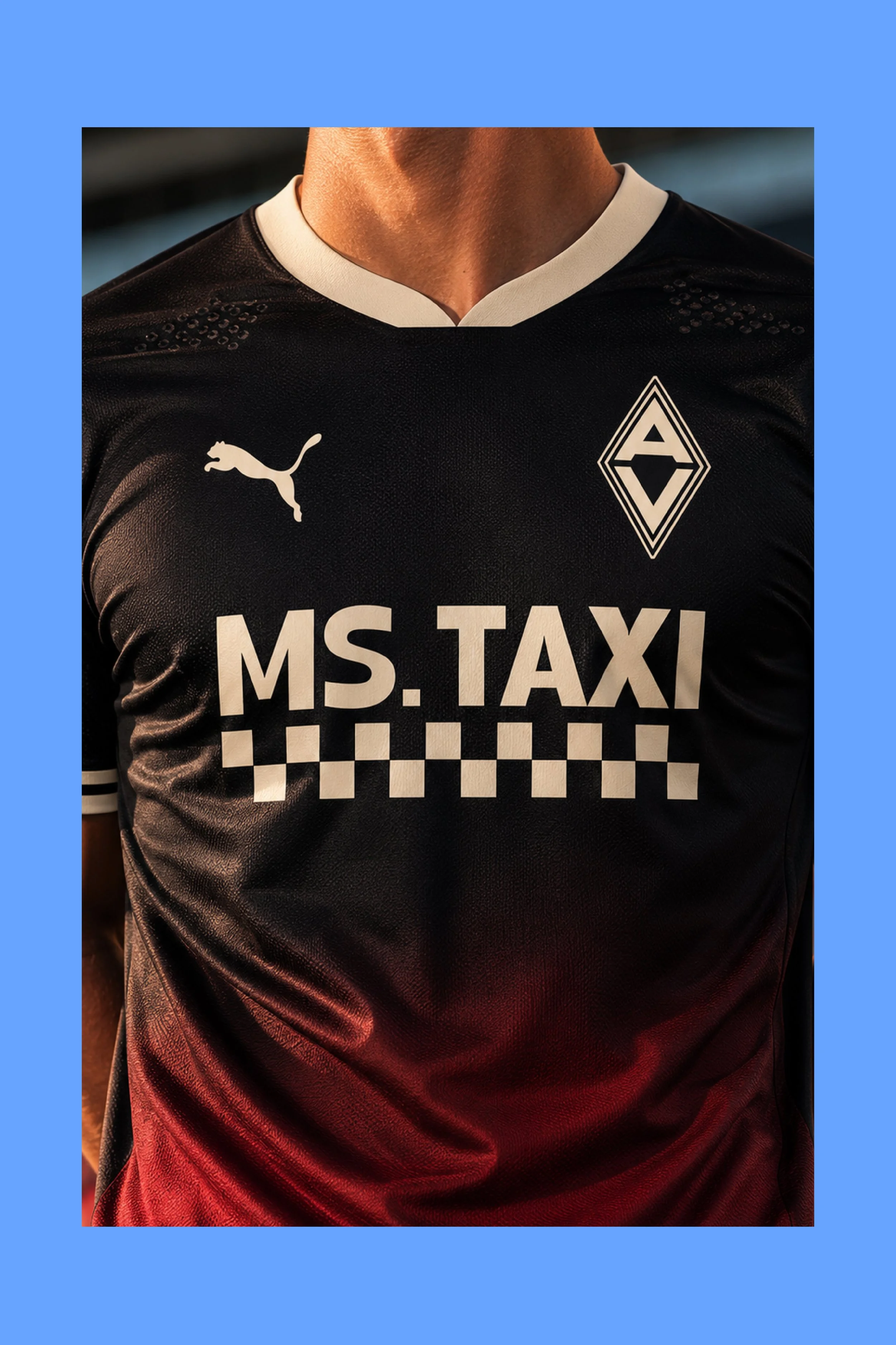
The Third Shirt is inspired by the area's proud pub culture and social traditions. The black base is complemented by a deep ruby fade rising from the hem, echoing the appearance of a freshly poured pint of Guinness as the rich red hues emerge beneath the dark head. Simple yet distinctive, the design celebrates the local gathering places that have long been at the centre of community life.
Club: Abbey View Football Club