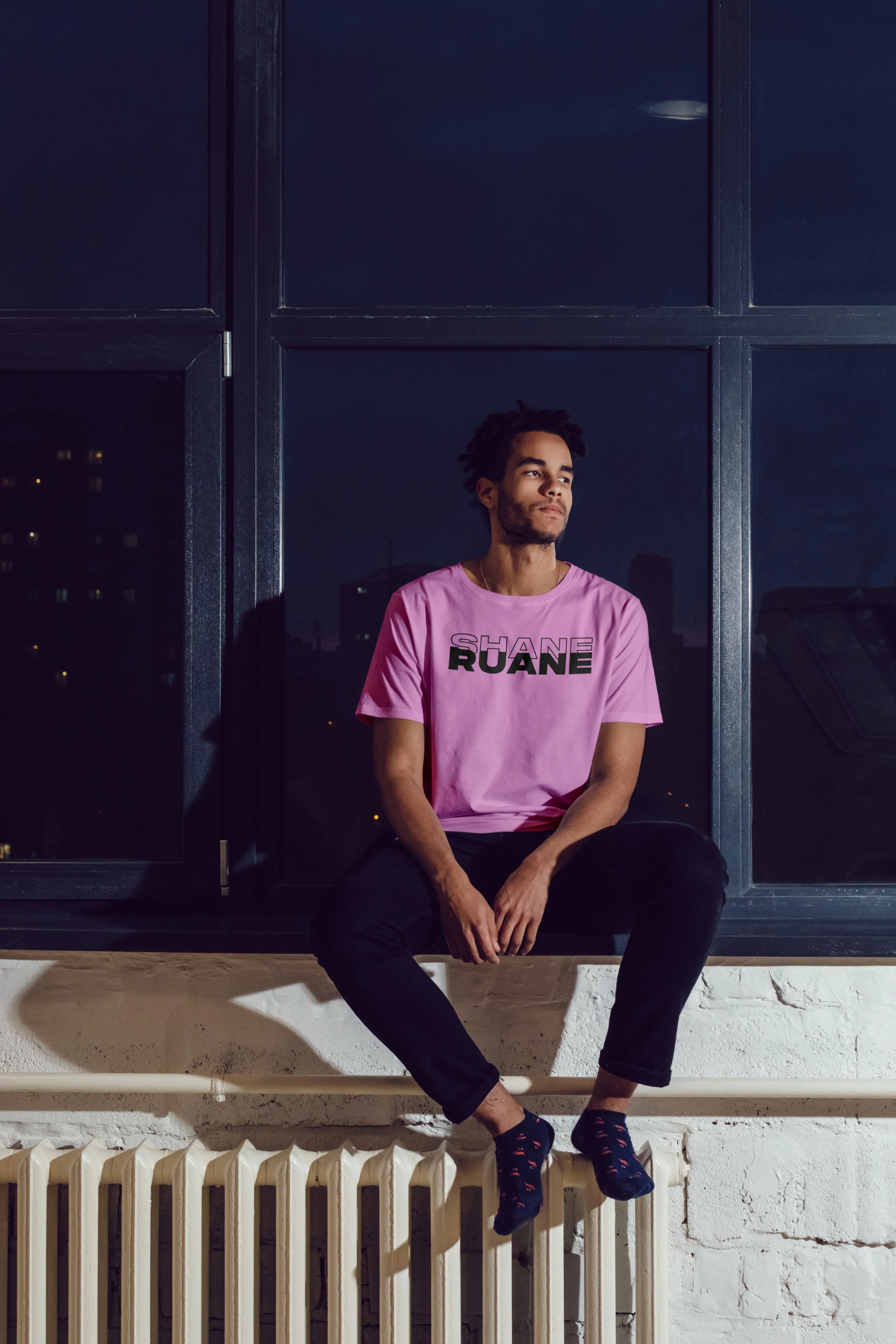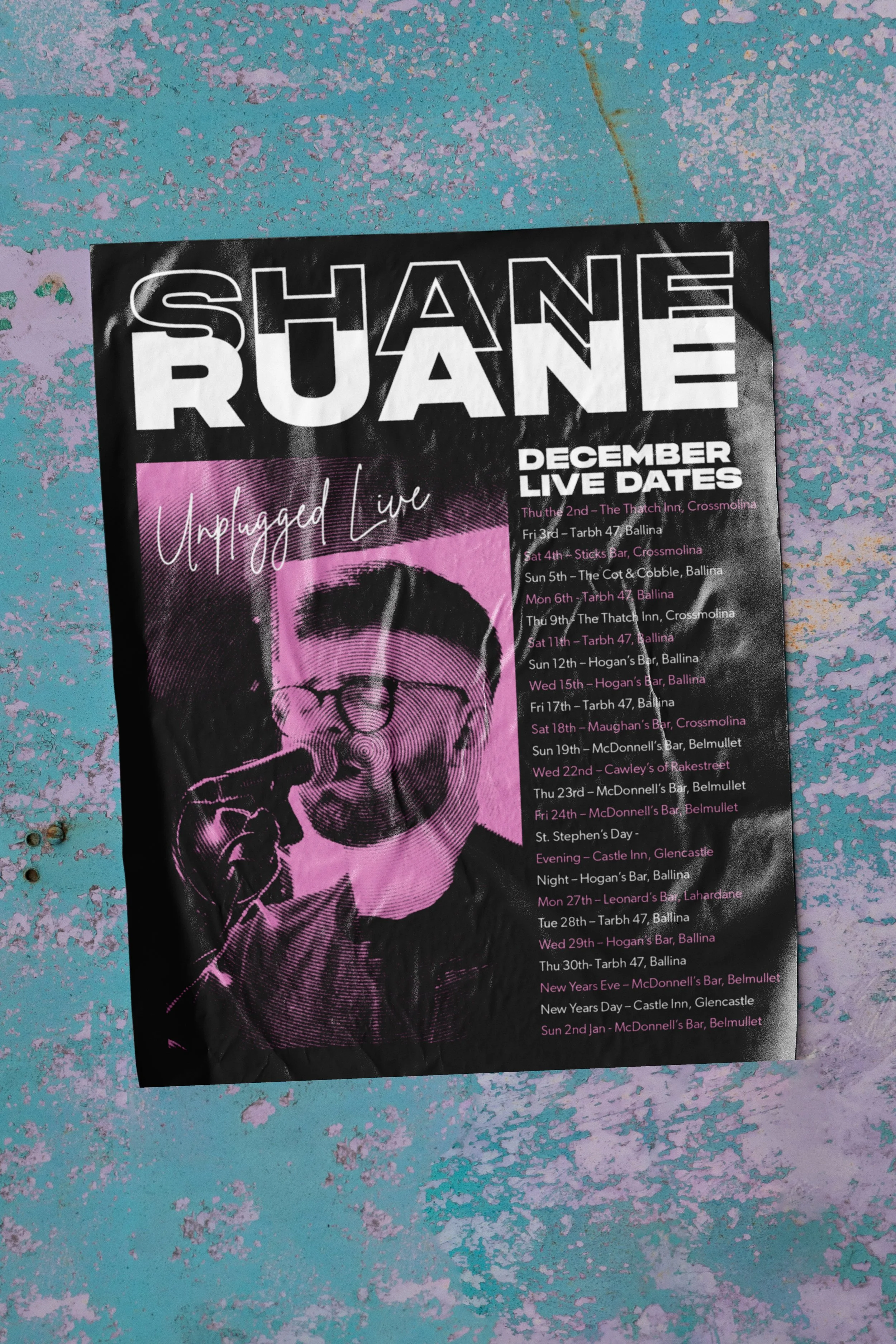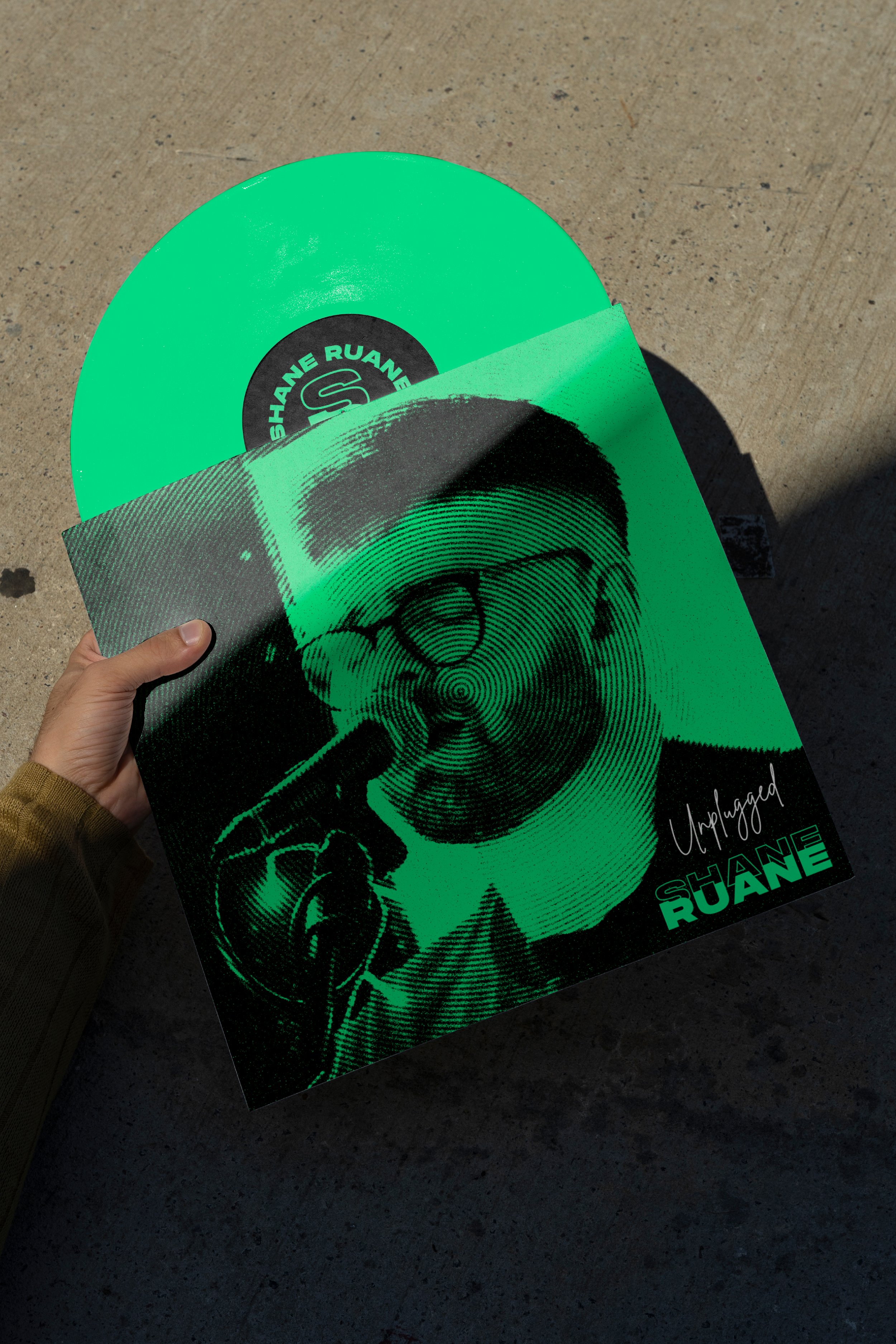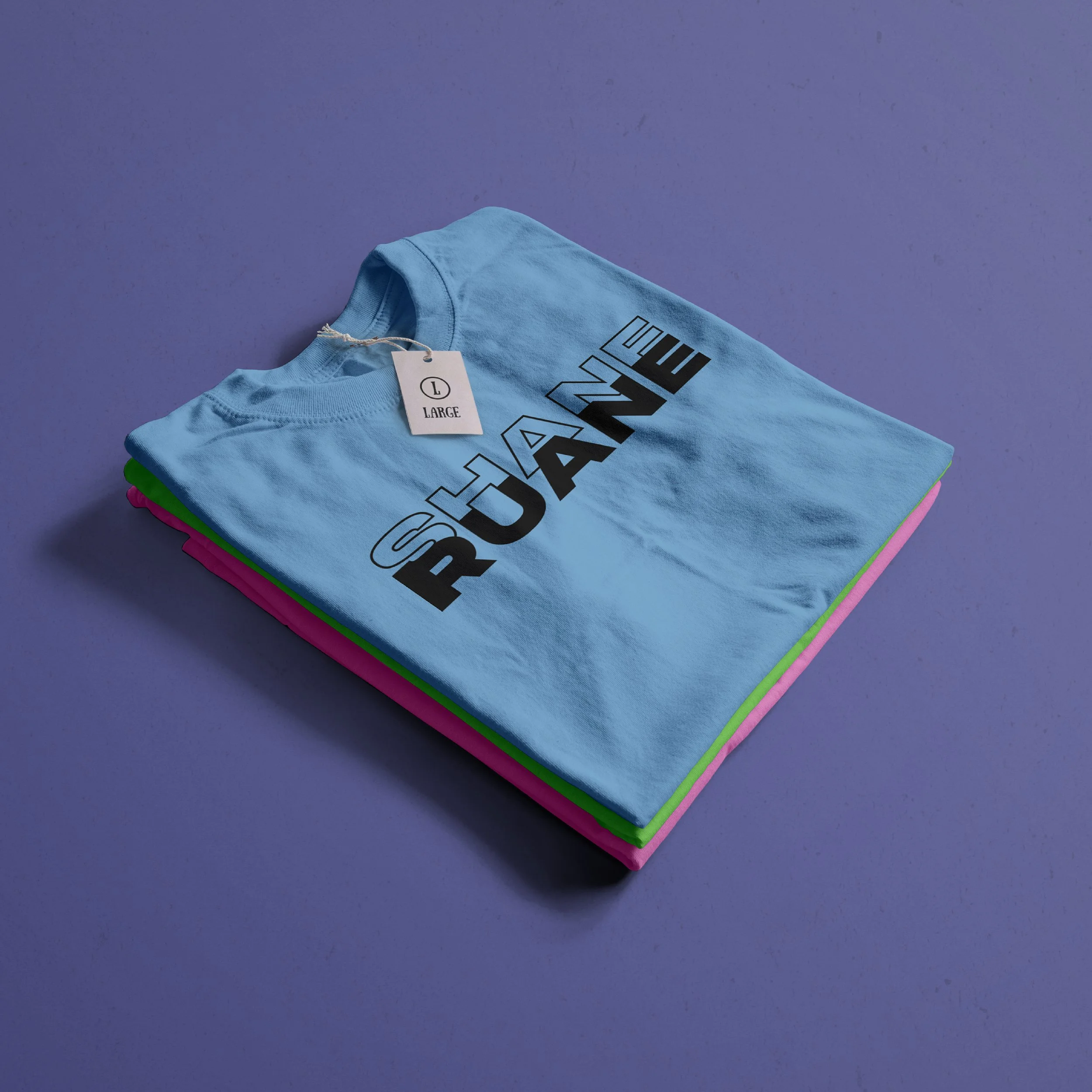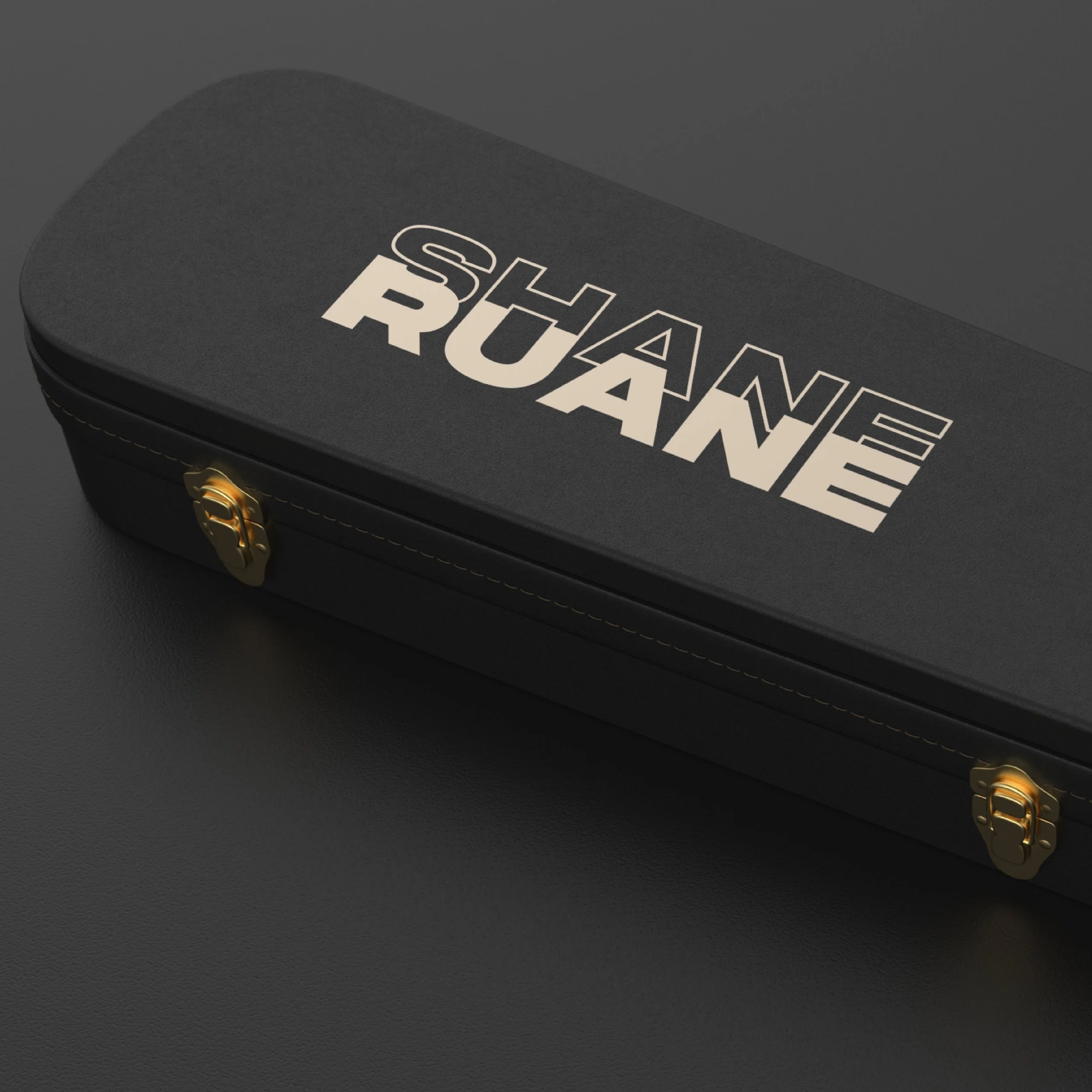
Shane Ruane’s identity was built around the natural relationship between the artist's first and last name. Both names share strong, bold letterforms, creating an opportunity for the typography to interact and overlap in a distinctive way.
The logo combines the two names into a single visual mark, with "SHANE" sitting within and alongside "RUANE" to create a layered composition. This approach reflects the idea of bringing separate elements together to form something memorable and unique - much like the atmosphere created through live music.
Designer: Patrick Lindsay